More actions
| Line 35: | Line 35: | ||
*The leftmost {{color|green|Layout}} button opens a menu that lets you change the display of star groups and jump lines. You can group systems by region or constellation, or you can have no grouping. Similarly, you can show all jump gate lines, all the ones in the region you are looking at, or just the ones connected to the star you have selected. At the bottom of this menu is a box labeled "Abstract Layout." Checking this box collapses the map into a flat, more 2-dimensional view. | *The leftmost {{color|green|Layout}} button opens a menu that lets you change the display of star groups and jump lines. You can group systems by region or constellation, or you can have no grouping. Similarly, you can show all jump gate lines, all the ones in the region you are looking at, or just the ones connected to the star you have selected. At the bottom of this menu is a box labeled "Abstract Layout." Checking this box collapses the map into a flat, more 2-dimensional view. | ||
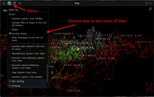
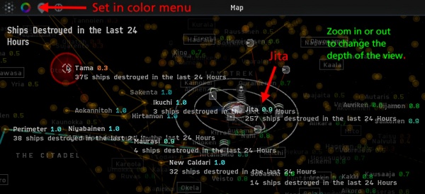
*The second, {{color|green|Color}} button opens an extensive menu of data items. Clicking on an item tells the map to color the stars according to that kind of data. "Security Status", for example, shows the typical green, yellow and red colors of the various levels. Some data types produce fuzzy balls around some systems - "Ships Destroyed in the Last 24 Hours" for example, puts a sphere around each star ... bigger for greater totals of killed ships. | *The second, {{color|green|Color}} button opens an extensive menu of data items. Clicking on an item tells the map to color the stars according to that kind of data. "Security Status", for example, shows the typical green, yellow and red colors of the various levels. Some data types produce fuzzy balls around some systems - "Ships Destroyed in the Last 24 Hours" for example, puts a sphere around each star ... bigger for greater totals of killed ships. | ||
*{{color|green| | *The third, greyish button opens a menu that lets you show or hide {{color|green|Solar System Markers}}. These show icons for such as planets, stations, locations, and asteroid belts. Markers are only visible when you are zoomed in for a closeup view of a system. | ||
== Using the Map Beta Controls == | == Using the Map Beta Controls == | ||
Revision as of 18:16, 15 February 2016
Map (Beta) While the Star Map is still the standard tool for finding your way through the universe, EVE has been testing a new map that they call "Map Beta". This page describes the features of the new map and shows how to access them.
Getting to the New Map Beta

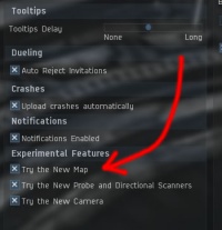
To use Map Beta you first have to tell the game that you want to access it. You do this in the game settings window, which you can open by pressing the ESC key.
Click on the "General Settings" tab, and then go down to the "Experimental Features" section. Check the box for "Try the New Map", and it will appear in your neocon under the name "Map Beta"
Next, go to the "Shortcuts" tab and then to the "Windows" tab in the shortcuts. There you will be able to set a hot key for "Map Beta".
The new and old maps are entirely separate. They do not interfere with one another, and you can have both of them open at once if you want to. (Note that Map and Map Beta are both full blown maps and so are different from the "Map Browser", which is a kind of mini-map.)
Map Beta Overview

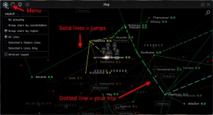
Map Beta is three-dimensional. Stars are shown as colored dots - the shades of which can be changed to represent different sorts of data: security status, services, sovereignity, number of pilots in space, and many others. Lines show the jump gate connections between stars, with the path from your current location to the selected system shown as dotted.
When you open the map, it will be centered on a Selected System. This is most often the system where you are currently located. You can use your mouse wheel to zoom in until you see the system in great detail ... planets, moons, stations, asteroid belts, etc. Or, you can zoom out until you see the entire universe.
Three buttons at the top right of the map control window activities.
- Clicking on the X will Close the Map Beta window.
- Clicking on the magnifying glass icon will open the Search box. As you begin to type in the box, the search will give you a list of matching star systems. Click on a star name to focus the map on that system and draw a dotted line to there from your current position. If you click on a moon or other object, that object will be focused in the center of the map, and the map will zoom in to show the star system in detail.)
- Clicking on the little square with the dot in the middle will open the Resize option box. Here you set the map window to full screen mode, dock it to either side of your screen, or tell it to float in the middle of your screen. The docked windows can be resized left or right ... the floating window can be resized in any direction.
Four buttons at the top left of the map control formatting.
- The rightmost "Focus" button will always center the map on your position.
- The leftmost Layout button opens a menu that lets you change the display of star groups and jump lines. You can group systems by region or constellation, or you can have no grouping. Similarly, you can show all jump gate lines, all the ones in the region you are looking at, or just the ones connected to the star you have selected. At the bottom of this menu is a box labeled "Abstract Layout." Checking this box collapses the map into a flat, more 2-dimensional view.
- The second, Color button opens an extensive menu of data items. Clicking on an item tells the map to color the stars according to that kind of data. "Security Status", for example, shows the typical green, yellow and red colors of the various levels. Some data types produce fuzzy balls around some systems - "Ships Destroyed in the Last 24 Hours" for example, puts a sphere around each star ... bigger for greater totals of killed ships.
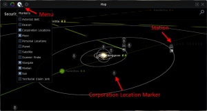
- The third, greyish button opens a menu that lets you show or hide Solar System Markers. These show icons for such as planets, stations, locations, and asteroid belts. Markers are only visible when you are zoomed in for a closeup view of a system.
Using the Map Beta Controls
--Using DOTLAN with the Map Beta--
