More actions
m Change link to bypass redirect page with incorrect capitalization. |
|||
| (4 intermediate revisions by 3 users not shown) | |||
| Line 1: | Line 1: | ||
Being able to tell if there's a war target in the system is just one of many ways to [[Tips_For_War|survive during wartime]]. | Being able to tell if there's a war target in the system is just one of many ways to [[Tips_For_War|survive during wartime]]. | ||
| Line 31: | Line 4: | ||
== War target icon == | == War target icon == | ||
The war target icon is a <span class="flashy"> | The war target icon is a <span class="flashy">[[image:ColorTag-StarRed9.gif|9px|link=]]</span> red box with a white star in it (blinking if you have it set according to EVE University standards, see the [[Overview Guide]]). Not to be confused with the [[image:ColorTag-MinusRed9.gif|9px|link=]] '''Terrible standing''' (-10) and [[image:ColorTag-MinusOrange9.gif|9px|link=]] '''Bad standing''' (-5) icons or the <span class="flashy">[[image:ColorTag-SkullRedBlack9.gif|9px|link=]]</span> '''Criminal''', <span class="flashy">[[image:ColorTag-SkullYellowBlack9.gif|9px|link=]]</span> '''Suspect''' or [[image:ColorTag-SkullOrange9.gif|9px|link=]] [[Standing_and_status#Outlaw|Outlaw]] tags. | ||
== Local == | == Local == | ||
| Line 39: | Line 12: | ||
War targets will have the red square with a white star inside in the member list, clearly identifying them as a war target. See the area circled in red on the screenshot to your right. There's also a number in the top-right showing how many capsuleer are in the system, which is also circled in blue on the screenshot. A spike (sudden rise) in the number of players in the system could mean the arrival of a fleet or reinforcements. Naturally, checking the number of people in a system is far easier in a less active system, compared to a heavily trafficked system. | War targets will have the red square with a white star inside in the member list, clearly identifying them as a war target. See the area circled in red on the screenshot to your right. There's also a number in the top-right showing how many capsuleer are in the system, which is also circled in blue on the screenshot. A spike (sudden rise) in the number of players in the system could mean the arrival of a fleet or reinforcements. Naturally, checking the number of people in a system is far easier in a less active system, compared to a heavily trafficked system. | ||
The member list will show everyone regardless if they are cloaked, never speaks in local, | The member list will show everyone regardless if they are cloaked, never speaks in local, are active or inactive, docked up or in space; As long as they are logged into the game and currently somewhere in that system, they'll show up in the 'local' list. The list also updates immediately to remove people who leave the system or logs off. | ||
=== Wormhole space === | === Wormhole space === | ||
The only exception to the normal behaviour of people showing up in local is for [[ | The only exception to the normal behaviour of people showing up in local is for [[wormhole space]], where players will not automatically show up in the member list until they actually speak up in local. | ||
<div style="clear: both"></div> | <div style="clear: both"></div> | ||
| Line 48: | Line 21: | ||
There are many improvements you can make in order to make local easier to keep an eye on, and to show more of what you need and less of what you do not need. | There are many improvements you can make in order to make local easier to keep an eye on, and to show more of what you need and less of what you do not need. | ||
First of all, the default settings for your local window uses up a lot of space for things that are of little to no interest. Big | First of all, the default settings for your local window uses up a lot of space for things that are of little to no interest. Big portraits both in the chat window and the member list, reduce the number of pilots shown in the member list as well as taking up multiple lines in the chat window. This can be improved by changing a few settings, by clicking the cogwheel or people icon in the settings bar, as shown below. | ||
{| | {| | ||
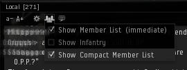
| valign="top" | [[image:local_compact_list.png|thumb|The '''Show Compact Member List''' option will remove the portraits from the member list, allowing for more names to be shown.]] | | valign="top" | [[image:local_compact_list.png|thumb|The '''Show Compact Member List''' option will remove the portraits from the member list, allowing for more names to be shown.]] | ||
| Line 59: | Line 32: | ||
|} | |} | ||
{{FlashyCSS}} | |||
[[Category:Guides]] | [[Category:Guides]] | ||
[[Category:PvP]] | [[Category:PvP]] | ||
[[Category:User Interface]] | [[Category:User Interface]] | ||
Latest revision as of 12:17, 21 June 2022
Being able to tell if there's a war target in the system is just one of many ways to survive during wartime.
| A long, long time ago... |
|---|
| Prior to the update in March 2016 the watchlist allowed you to view online and offline status of people, regardless if they had you on their watchlist or not. This was used as an intel tool for corporations and alliances with decent intel networks (or even individuals), as you could just watchlist the people you needed to keep tabs on, allowing you to quickly see if your war targets were even online. |
War target icon
The war target icon is a ![]() red box with a white star in it (blinking if you have it set according to EVE University standards, see the Overview Guide). Not to be confused with the
red box with a white star in it (blinking if you have it set according to EVE University standards, see the Overview Guide). Not to be confused with the ![]() Terrible standing (-10) and
Terrible standing (-10) and ![]() Bad standing (-5) icons or the
Bad standing (-5) icons or the ![]() Criminal,
Criminal, ![]() Suspect or
Suspect or ![]() Outlaw tags.
Outlaw tags.
Local
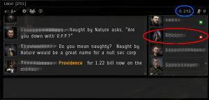
You'll always have two tabs in EVE Online, Local and Corp. If you're in a player corporation you might also have an Alliance tab as well as one or more personal channels. The Local-tab is just a chat channel in general, but the member list on the right shows every capsuleer who's logged into EVE Online and currently in the same system as you are.
War targets will have the red square with a white star inside in the member list, clearly identifying them as a war target. See the area circled in red on the screenshot to your right. There's also a number in the top-right showing how many capsuleer are in the system, which is also circled in blue on the screenshot. A spike (sudden rise) in the number of players in the system could mean the arrival of a fleet or reinforcements. Naturally, checking the number of people in a system is far easier in a less active system, compared to a heavily trafficked system.
The member list will show everyone regardless if they are cloaked, never speaks in local, are active or inactive, docked up or in space; As long as they are logged into the game and currently somewhere in that system, they'll show up in the 'local' list. The list also updates immediately to remove people who leave the system or logs off.
Wormhole space
The only exception to the normal behaviour of people showing up in local is for wormhole space, where players will not automatically show up in the member list until they actually speak up in local.
Making the most of your local window
There are many improvements you can make in order to make local easier to keep an eye on, and to show more of what you need and less of what you do not need.
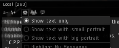
First of all, the default settings for your local window uses up a lot of space for things that are of little to no interest. Big portraits both in the chat window and the member list, reduce the number of pilots shown in the member list as well as taking up multiple lines in the chat window. This can be improved by changing a few settings, by clicking the cogwheel or people icon in the settings bar, as shown below.
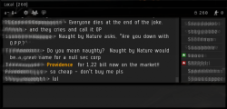
The end result is a much more compact local window that should give you much more information. You should also drag it out of the 'stack' of chat channels and move it to the side of your screen. Moving it to the side and extending it as tall and thin as you can on your screen, lets you easily see a list of as many people as possible in the same system as you at all times.

