|
|
| (312 intermediate revisions by 70 users not shown) |
| Line 1: |
Line 1: |
| − | {{uwc}}
| + | [[File:Overview eve university travel tab.png|thumb|EVE University's Overview]] |
| | | | |
| − | The Overview Guide is a step-by-step guide, designed to teach new players how to set up their own overviews in Eve Online. | + | The '''overview''' is one of the most essential components of EVE's user interface and is the primary means of viewing items in space. It is a customizable list of interactive entries and can assist players with virtually every activity performed in space. Preparing your Overview to fit your own personal preferences are essential to you having a successful time playing EVE Online. |
| | | | |
| − | The guide contains a full walk-through of how to set up a complete overview from start to finish, with the following presets: | + | The game comes with a default overview set, which is often insufficient for most player's means. It is often better to pick a [[#Overview_pack|player built overview]] and build on it. Keeping the overview up to date is important as CCP is adding new ship types to it regularly. A misconfigured overview can result in loss of a ship or worse, a diplomatic incident of friendly fire. |
| | | | |
| − | *PvP
| + | == Understanding your Overview == |
| − | *PvP + Drones
| |
| − | *PvP Travel
| |
| − | *PvP Travel without neutrals
| |
| − | *Missions
| |
| − | *Mining
| |
| − | *Looting
| |
| − | *Pod Saver
| |
| − | *Wormhole
| |
| | | | |
| − | Setting up your overview is compulsory for Uni fleets. It is very important to have your overview set up properly. Your overview presets are your eyes in EVE Online.
| + | === Tabs === |
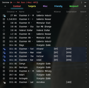
| | + | [[File:Overview tabs.png|none|frame|Tabs in your overview after [[#Installing the EVE University Overview|installing the EVE Uni Overview]] in-game]] |
| | + | The tabs in your Overview are customizable columns that you could use to filter out different entities/targets you would like to see while you are in space. |
| | | | |
| − | <br>
| + | === Content === |
| | + | [[File:Overview content.png|none|frame|The main contents of your overview in-game]] |
| | + | The content area of your Overview will display all currently filtered entities/targets in a list here. |
| | | | |
| − | <div style="float:right; font-size:80%; line-height:125%; list-style-type:none; text-indent:0in; margin-left:0px; padding:0.5em;">__TOC__</div>
| + | == Interacting == |
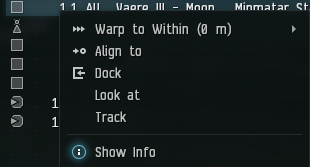
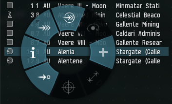
| | + | You can interact with objects in the overview by right-clicking them and selecting the appropriate action. Alternatively, the object can be click-and-held in order to open the radial menu. |
| | | | |
| − | = Getting Started = | + | === Right-click Menu === |
| | + | [[File:Overview right click.png|none|frame|The right-click menu in-game, accessed by right-clicking a row in your Overview]] |
| | | | |
| − | === What is the overview? === | + | === Radial Menu === |
| | + | [[File:Overview radial menu.png|none|frame|The radial menu in-game, accessed by click-and-holding a row in your Overview]] |
| | | | |
| − | In EVE Online, the overview is the only practical way to organize and view items in space. It is a customizable list of interactive items. It is one of the most important parts of EVE's interface, and will help you in PvP, missions, mining, traveling - practically every activity in EVE requires use of the overview. It is vitally important that you set up your overview in a way that is not confusing, and will allow you to easily see whatever you want to see at any given time. The consequences of not setting up your overview properly could range from not being able to see a war target and subsequently getting destroyed, to firing on your own ally because he appeared as a hostile, to being destroyed by NPC pirates that didn’t even show up on your screen.
| + | === Shortcuts === |
| | + | Alternatively, in many situations, you may want to use shortcuts for faster actions; almost all actions have shortcuts. These shortcuts can be set in the "combat" section of the shortcut settings. |
| | | | |
| − | <br>
| + | Simply hold the action shortcut key down and click the object in overview or in space. Additionally, you can first select the object and then click the shortcut key. |
| | | | |
| − | === Newbie Tips ===
| + | For example: to target an object, just hold {{button|CTRL}} and click the object you want to target or select the object in your overview and then press {{button|CTRL}}. |
| | | | |
| − | Hold down the '''Control''' key on your keyboard, and left click once with your mouse on an item in your overview to lock it. Holding down the control key will also freeze your overview in place, to prevent items from shuffling around based on the sorting order. This will help prevent you from locking the wrong targets by accident. When you are holding down the control key, all new items that appear on the overview will be added at the bottom of the list, and items that disappear from the grid will be shown in a faded text. Releasing the control key will re-sort your overview automatically.
| + | Moreover, by double-clicking an object you will approach/align to it. |
| | | | |
| − | Double click an item on your overview to approach it.
| + | ==== Locked Status ==== |
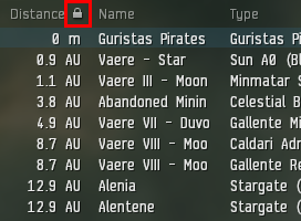
| | + | [[File:Locked column.png|none|frame|The locked status is shown by a padlock symbol in the column that is used for sorting]] |
| | | | |
| − | <br>
| + | While any of the shortcuts are being pressed, the overview will be frozen to prevent items from shuffling around based on the sorting order. While the overview is frozen, all new items that appear on the overview will be added at the bottom of the list and items that disappear from the grid will be shown in a faded text (refer to image above). |
| | | | |
| − | === Organizing your screen layout === | + | == Filtering == |
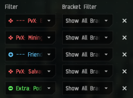
| | + | [[File:Filters vs bracket filters.png|none|frame|Filters vs Bracket Filters in Overview Settings]] |
| | + | Filters control what shows up in your Overview window, Bracket Filters control what shows up on your actual in-game screen. |
| | | | |
| − | [[Image:KVVAQ.jpg|thumb|Screen Layout Sample]]
| + | EVE isn’t a very system-intensive game, and some people have computers that can easily handle the game on max settings. If your system can handle it, you can select '''show all brackets''' in the overview options for each tab. (Brackets are the symbols (icons) you see when in space). This will let you see friendly and hostile ship brackets on the field as well as neutrals and drones. Having all brackets turned on can help you identify an on-grid fleet mate to use as a warp-in. Many players fly with all brackets turned on, and it is recommended to do so if your system can handle it. Zooming out the camera with all brackets turned on will give you a good view of what's happening on the battlefield. |
| | | | |
| − | Before you even touch the overview itself, however, you should organize the rest of your interface. EVE is a game of communication and numbers - your screen layout should reflect this.
| + | In very large fleet fights, it is recommended to have brackets turned off, as a large number of visible brackets will cause server-side lag when there are hundreds of players shooting at each other in the same system. Most nullsec corps will have instructions for their members on how to minimize lag during large encounters. |
| | | | |
| − | #Undock and find a safe place to sit. You will be sitting out in space for around half an hour. The POS in Aldrat is a good place to do this - ask another player in corp chat if you don’t know where it is. '''Alternatively, do this on an alternate character on the same account.''' The changes will carry across to all characters ''on that account on the same computer''. <font color="red">This is required for characters in E-UNI during wartime. </font>
| + | You can press {{button|Option}} + {{button|Z}} (for Mac) or {{button|ALT}} + {{button|Z}} (for PC) to toggle all brackets. |
| − | #<font color="red"></font>You can also set up the overview settings without undocking from station, if you set up a shortcut key to access the overview, as shown here:<br> [[Image:Overviewwhiledocked2.png]]
| |
| − | #Click the fleet button (on the Neocom panel), click the lines at the top left of the fleet window, and then click '''Form Fleet'''. You will see that you are now in a Fleet. You may need to reposition and resize the fleet window during fleet ops; sometimes you need it small and out of the way, other times you need to expand it to find pilots in the list.
| |
| − | #Make your overview '''nice and big''' - it is your main source of information. You could have it running from top to bottom on the right side of my screen, with '''Selected Item window''' just above it, and the '''Drone Bay window''' just below it.
| |
| − | #During a fleet, you’re going to need to have chat windows open. You generally have two windows open at once - fleet chat and squad chat. I like to keep them on the left side of the screen in separate windows.
| |
| − | # There is no six!
| |
| − | #Another window you should have separated is '''Local chat'''. Local is very important in ascertaining who is in system with you. A lot of players like to have it narrowed to the smallest width. You may want to remove portraits from the local chat to make chatter easier to read. The local window is often positioned either running down the left side of the screen between the NeoCom and the chat channels, or just to the right of the chat channels. The more height your local window has, the easier it is to spot potential hostiles in a system.
| |
| − | #You should also leave space for your watch list, but you can only get that when you have other people in your fleet.
| |
| − | #Press escape and go to the '''General Settings tab'''. Under the '''Windows''' subheading, check '''Lock windows when pinned'''. This will ensure your overview and other windows don’t go anywhere.
| |
| − | #Pin your overview and any other windows of your choice. This will allow you to see through them.
| |
| | | | |
| − | Remember that your interface should be set up the way it is most convenient for you - feel free to change your windows around once you work out what you want.
| + | Alternatively, you can create a tab preset that only includes bare minimum brackets and use that as the bracket preset. |
| | | | |
| − | '''''Hint -''''' You can move your ship and modules display to the left and right by holding shift and clicking on your capacitor and dragging. You can even move it to the top of your screen: Click the white arrow below the speedometer, then "Align Top" at the bottom of the menu which appears.
| + | == Tagging == |
| | + | Note: By default, tags are not shown in the overview. If tags are going to be used it is recommended that the "tags" column be added to the overview. This is done in Overview Settings -> Columns. |
| | | | |
| − | '''''Another hint -''''' You can move your targeted objects around your screen as well. Notice that near the upper-left or upper-right corner of your targeted items (you will have to target something to see these), there is a very faint cross-hair. Click and drag that cross-hair around to change the location of your targets.
| + | The Tag feature allows you to assign a number or letter to individual ships or objects in space which will be visible in the Tag column of the overview. Tagging is different from [[Fleet]] broadcasts though they are often used for similar purposes. |
| | | | |
| − | Now go to right click the 4-lined box on your '''Fleet tab''' and select '''Leave fleet''' . Your screen should be mostly set up for the next fleet op. Next time you go on an op, don’t forget to separate your squad and fleet chat windows and to add important fleetmates to your Watch List.
| + | The tag will remain assigned to the object until it is destroyed, you dock in a station, or enter a jump gate. This is useful for marking trigger ships during missions, marking trigger ships and kill order in wormhole sleeper sites, prioritizing PvP targets, or any other activity for which you may need to quickly identify specific objects for a fleet. Only fleet members in command positions can mark tags. |
| | | | |
| − | Now that we’ve gotten that down, let’s get onto the overview itself.
| + | === Tagging process === |
| | + | The Tag option is only available while you are a member of a fleet and in a command role (i.e. FC, WC, or SC). If you are alone, you may simply form a fleet with yourself (your default role with be FC). |
| | | | |
| − | <br>
| + | To tag an object, simply right-click, select "Tag" from the context menu, and you will be given a choice of numbers or letters. Pick the number or letter you wish to use and you are done. |
| | | | |
| − | = The Overview Settings =
| + | A faster method to tag targets is to use the "tag item as" shortcut key. Note that all "tag item as" actions do not have a key bound to them by default. These shortcuts are in the "combat" section of shortcut settings. |
| | | | |
| − | === Viewing Overview Settings === | + | == Installing the EVE University Overview == |
| | + | Using the default overview is generally not recommended. Instead, players should either set and manage their own overview or use a well-maintained overview pack. |
| | | | |
| − | To view all your overview settings, do the following: [[Image:Overview Settings Box.png|right|Overview Settings Box.png]]
| + | We have a quick-start Overview guide to help you get started easily. |
| | | | |
| − | #Right click on '''the 4-lined box''' ([[File:Overview-FourLines9.gif]]) on your '''Overview tab'''.
| + | Follow the steps below to setup the EVE Uni Overview and read on to learn more about the Overview itself. |
| − | #Click on the third last option, '''Open overview settings'''.<br>
| |
| | | | |
| − | <br>
| + | === Step 1 - Opening up Overview Settings === |
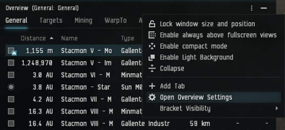
| | + | [[File:How to get to overview settings.png|none|frame|How to access your Overview Settings while in space in-game]] |
| | + | # It it recommended that you are flying in space to setup your Overview for the first time (Other methods of opening up this window can be found in [[Overview settings]]). If you are currently in a station, click on Undock. |
| | + | # Once undocked, stop your ship at a safe location near the station or elsewhere. |
| | + | # Click on the " ⋮ " icon on the top right of your Overview and click on Open Overview Settings (refer to image above). |
| | | | |
| − | You should now see your overview settings window, complete with six different tabs.
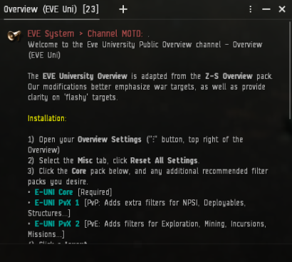
| + | === Step 2 - Getting the EVE Uni Overview in-game === |
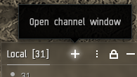
| | + | [[File:Open channel window.png|none|frame|Open channel window from the chat box]] |
| | + | Click on the " + " icon located on the top right of your chat channel window. |
| | | | |
| − | If you are docked, you can still view and alter your overview settings, but you need to set up a shortcut to do so. Press Escape, go to the Shortcuts tab. Within the Shortcuts tab, go to the Window tab. Scroll down and you will find an ''Open Overview Settings'' option - set any keybind to this command. Now you can use this keybind even when in a station, and you will open the Overview Settings window. This image [[Media:Overviewwhiledocked.png]] may help if you are having trouble.
| |
| | | | |
| − | '''NOTE - This guide will cover optimizing overview settings in the next chapter. For now, follow along in your own overview and learn.'''
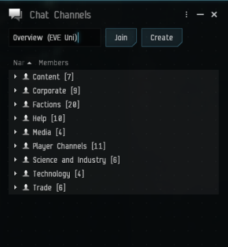
| + | [[File:Accessing eve uni overview.png|none|frame|Accessing the Overview (EVE Uni) channel]] |
| | + | In the top input field, type in "Overview (EVE Uni)" and click Join. |
| | | | |
| − | <br>
| |
| | | | |
| − | === The Filters Tab ===
| + | [[File:Overview eve uni channel.png|none|frame|The Overview (EVE Uni) channel]] |
| | + | You will now see the channel's Message of the Day (MOTD), follow the installation steps there in-game and you are done! |
| | | | |
| − | ==== Types ==== | + | === Advanced settings === |
| | + | If you want to further tweak your Overview to fit your personal preference, more details on the overview settings are found in the [[Overview settings]] article. |
| | | | |
| − | The types tab is where you select what you want to see on your overview. You can use this tab to select specific things - if you’re a veldspar miner, you might only want veldspar asteroids and NPC rats. If you’re a PvPer, you might only want ships on your overview, or maybe even just specific types of ships.
| |
| | | | |
| − | *'''Asteroid:''' Pretty self explanatory - all your different types of asteroids.
| + | == Overview pack == |
| − | *'''Celestial:''' All your large celestial objects - planets, moons, wormholes, and so on. Also contains beacons (cynosural fields), biomass (corpses), stargates and wrecks.
| + | Before you proceed : {{Color|wheat|It is highly recommended that you follow the guide to build your own overview pack because it will help you understand the various Overview settings, which space object falls into what category, and how the Overview in whole works.}} |
| − | *'''Charge:''' Contains bombs, which can now be deployed by stealth bombers, but only in 0.0 space. These are very dangerous - always good to have them on your overview. It also includes probes, which are usually good to have checked, as having them on overview makes seeing them on d-scan easier.
| |
| − | *'''Deployable:''' Mobile warp disruptors, otherwise known as bubbles. These are the deployable type that get anchored in space. The other type are used by interdictors and heavy interdictors, and don’t show up on your overview.
| |
| − | *'''Drone:''' All your various types of drones. Useful if you want to target drones of any kind, especially fighter drones.
| |
| − | *'''Entity:''' Some of your mission rats (NPC enemies), as well as a few useless things like billboards.
| |
| − | *'''NPC:''' Concord, some npc faction ships, and some rats.
| |
| − | *'''Planetary Interaction:''' Contains only one type of objects - planets' customs offices.
| |
| − | *'''Ship:''' Player-owned ships. Usually you’ll have all of these selected, unless you want to target specific types of ships.
| |
| − | *'''Station:''' Pretty self-explanatory.
| |
| − | *'''Structure:''' POS structures and modules - you might use these if you were attacking one, or living in one.
| |
| | | | |
| − | <br>
| + | {{important note box |
| | + | | With the "Hyperion" release .yaml has replaced .xml as the format for exported Overview files. Please note that .xml imports will be supported for a limited time as per [https://www.eveonline.com/news/view/sharing-is-caring CCP] |
| | + | }} |
| | | | |
| − | ==== States ====
| + | Any overview pack that you choose to download & then upload to your client should undergo extensive double-checking and possible re-working. There are known issues with uploading to a different client or computer. See above. |
| | | | |
| − | In the States tab, you can further define what you want to see in the overview. Whilst the Types tab is pretty straightforward, some care has to be taken with the States tab.
| + | Overview packs are '''pre-built sets of overview profiles''' and, in most cases, include their own set of settings, such as bracket display and labeling. This allows players to quickly import several overview profiles at once. There are also many other features that can be included on overview packs in comparison to your basic overview; depending on each of the overview packs currently available in public, two of the common features most overview packs promote are: |
| | + | * Customizing how the overview brackets are displayed |
| | + | * Customizing how the overview tabs are displayed |
| | + | Bear in mind that overview packs are not official products made by CCP; they are custom-built, third-party releases. |
| | | | |
| − | '''IMPORTANT:''' States doesn’t let you say what you want to see, rather it lets you say what you don’t want to see.
| + | There are also several other advantages of using or releasing overview packs. One aspect worth mentioning: some overview packs are designed with a number of careful considerations and standards applied. This is especially important with some corporations, big alliances, or coalitions. For instance, many of the overview packs may release "set X" profiles, which are used in important scenarios and, in turn, used by members of certain organizations; there is also the case of standardization across these profiles. While building your own overview can be good (or better on some cases), using the same overview pack across many players at once enables you to follow and issue commands or intel with the knowledge that the other person who listed or gave that intel has the same overview setup as yours. |
| | | | |
| − | ''If a player has an attribute that you '''haven’t''' selected, they '''won’t show up on your overview'''.''
| + | === Commonly known & used overview packs === |
| | + | Below are some of the widely known overview packs available. (Note: These overview packs are not to the EVE UNI standards and are for experienced players only) |
| | | | |
| − | '''Example:''' You want to see a war target, so you select '''Pilot is at war with your corporation/alliance'''. You would think this would give you war targets on your overview, but it’s a bit more complicated than that. | + | There is an in-game channel that [[ISD]] is referencing called '''Overview List''' as well that has all known overviews, including EVE Uni's Overview. Click the + in a chat channel to see this list. |
| | | | |
| − | Suppose that player also has a bounty on him. Since you haven’t got bounty checked, he won’t show up. You need to select all the attributes that a war target could possibly have in order to see war targets.
| + | '''''{{Co|yellow|IMPORTANT}}''''': If an overview is older than September 18th, 2024 ([https://www.eveonline.com/news/view/patch-notes-version-22-01]), it will be missing the new mining fields, officer rats in empire, structure fighters, and before July, [[Dreadnoughts|Lancer Dreadnought]] from overview. Can add manually under '''/open overview_settings''' | ''Filters'' | ''Types Shown'' | ''Ships'' | ''Lancer Dreadnought'' on all PvP tabs. The latest major revision was in September 18th, 2024, with the addition of changes for Equinox. |
| | | | |
| − | Additionally, the States tab and the Types tab interact which often leads to problems and confusion for newer players. For example, if you are setting up a drone preset where all you want to see are drones and nothing else [i.e. no ships, no rats etc.], many newer players will deselect everything in Types except for Drones and then deselect everything in States thinking that those attributes deal only with showing pilots - which is what you don't want in your Drones preset. The problem with this is that you will not see your Drones in the Overview because Drones belong TO pilots; in order to see your own drones, you must select "pilot is in your alliance" in the States tab. If you want to see the drones of your enemies, then you will also have to select "pilot is at war with your corporation/alliance" etc. Feel free to test this out with your own drones, you will be pleasantly surprised. The same principle applies if you're mining with jetcans, if you only select "Cargo Container" under Celestial in Types and deselect everything in States, nobody's cans will show up in your overview because by deselecting everything in States, you are not allowing your Overview to show cans that belong to pilots - and since all cans invariably belong to a pilot, none will thus show. This same principle applies to other objects like wrecks etc. because the States tab doesn't just show pilots, but it shows what those pilots own.
| + | * [https://barkkor.blogspot.com/p/overview.html Barkkor Overview] ('''{{Co|red|Out of date}} May 2023''') |
| | + | : An very easy to use and reliable Overview for both PvP and PvE. Gets frequent updates. |
| | + | : Available in-game in "'''Barkkor'''" Channel. |
| | + | * ''Iridium Overview'' ('''{{Co|red|Out of date}} Nov 2023 (Havoc)''') |
| | + | :8 tab overview pack designed for every EVE player, newbie, or veteran. This overview will be useful in both fleet and solo PvP, ratting, mining, looting, and exploration in all types of space. |
| | + | : Available in-game in the "'''Iridium Overview'''" channel. |
| | + | * [https://www.reddit.com/r/Eve/comments/ar406g/sarashawa_overview_pack_v_105_released/ SaraShawa Overview Pack] (Reddit Post) ('''{{Co|red|Out of date}} August 2021''') |
| | + | : A PvP-focused overview pack, fundamentally an update and expansion on Sarah's Overview Pack. |
| | + | : Available in-game in "SaraShawa-Overview" Channel. |
| | + | : It contains a massive list of pre-set overview settings that you can load on the fly, allowing for great versatility. |
| | + | * [https://wiki.signalcartel.space/Public:Signal_Cartel_Overview_Pack Signal Cartel Overview Pack] (The Explorer's Compendium) ('''{{Co|green|Up to Date}} July 2024''') |
| | + | : Tailored towards exploration with limited presets for PvE and PvP. |
| | + | : Available in-game in the "'''Explorer's Overview'''" channel. |
| | + | * [https://www.wckg.net/home/kisover Kisover] ('''{{Co|green|Up to Date}} Sep 2024 (Equinox)''') |
| | + | : Created by Kismeteer in 2010, single set of tabs for all players in Null sec, maybe not appropriate for low sec. |
| | + | : Available in-game via the mailing list '''Kisover2''' and in the "'''Kissist'''" channel. |
| | + | * [https://gitlab.com/Arziel/Z-S-Overview-Pack/ Z-S Overview] (GitLab) ('''{{Co|red|Out of date}} Nov 2023 (Havoc)''') |
| | + | : An all round Modular overview pack focused on all aspects of EVE's gameplay, allowing the use of generalized new-player friendly and/or very specific profile presets for tactical advantage. |
| | + | : Available in-game in "'''Z-S Overview'''" Channel and Mailing List. |
| | | | |
| − | This is the trick to the overview, and (apart from bugs) the most common reason why players can’t see all the things they want to see.
| + | '''''{{Co|yellow|IMPORTANT}}'' Review your Overview set-up regularly''' |
| | | | |
| − | <br>
| + | Pilots should routinely review their overview set-up to make sure it's current, especially when Updates have been released. On occasion, new entities get added to the game and are placed in new overview categories and are thus invisible in all old overviews. Also, some updates and patches may bring other changes to how the Overview works. |
| | | | |
| − | === The Appearance Tab === | + | == See also == |
| | + | * [[Overview settings]] |
| | + | * [[Installing the EVE University Overview]] |
| | + | * [[Third-Party Game Guides#EVE overviews|EVE overviews]] |
| | | | |
| − | ==== Colortag ====
| + | [[Category:User Interface]] |
| − | | |
| − | Colortags allow you to set which tags appear or do not appear, and which tags have priority. Setting colortags correctly is important because they dictate which state you see. For example, if you have '''Pilot has a bounty on him''' set higher than '''Pilot is at war with your corporation/alliance''', you will only see the black skull bounty colortag rather than the red star war target colortag. The consequences of this could obviously be very bad.
| |
| − | | |
| − | Also note that colortag settings also affect chat channels and brackets in space. Colortags can be set to blink; this is a good idea to make wartargets in local much more obvious, for example.
| |
| − | | |
| − | Another thing to remember is that changing these settings won’t dictate what you can and can’t see in your overview - you will still see all the things you dictated in the States tab. The only thing you’re changing here is how said things are displayed in your overview, in chat and in space.
| |
| − | | |
| − | The outlaw tag will not display for a pilot with -5 or lower security status in the local chat window. A pilot will only show as outlaw in local if he has gained that tag for reasons other than -5 or lower security status; such as a Global Criminal Countdown, or if he is flagged for aggression against yourself, or flagged for theft against your corp.
| |
| − | | |
| − | <br>
| |
| − | | |
| − | ==== Background ====
| |
| − | | |
| − | The Background tab allows you to change the background of items in your overview, as well as the background of icons in space. It doesn’t affect things in chat.
| |
| − | | |
| − | You can change the colour of the background of any pilot state. Generally, as backgrounds are quite distracting, many players keep them unchecked except for outlaws and war targets. In a situation where you want to be able to see neutrals or hostiles very clearly, such as in nullsec or wormhole space, it can be handy to keep all backgrounds checked.
| |
| − | | |
| − | You can also toggle flashing backgrounds. This is where the term “red flashy” comes from - players generally have war targets and outlaws set to a flashing red background. This is useful for highlighting certain pilots in your overview.
| |
| − | | |
| − | Like in the Colortags tab, backgrounds have priorities. If a pilot fulfills two or more criteria, the highest ranked one will take priority.
| |
| − | | |
| − | <br>
| |
| − | | |
| − | ==== EWAR ====
| |
| − | | |
| − | The EWAR lets you modify which electronic warfare notifications are shown on the overview. These notifications show up on the right side of the overview line belonging to the ship (or drone, or POS module, etc.) using the module. These should all be checked.
| |
| − | | |
| − | <br>
| |
| − | | |
| − | === The Columns Tab ===
| |
| − | | |
| − | Columns let you select which columns you want to see in your overview. Some of them are pretty useless, so you obviously don’t want those columns cramping your style.
| |
| − | | |
| − | *'''Icon:''' This is the object’s icon, useful for quickly seeing the difference between a stargate and a station, or a war target and a corp member.
| |
| − | | |
| − | *'''Distance:''' The object’s distance from your ship.
| |
| − | | |
| − | *'''Name:''' The name of the object, be it a player name, the name of a station, or the name of a stargate or another item.
| |
| − | | |
| − | *'''Type:''' Shows what type of ship a pilot is flying, which is a very useful thing to know.
| |
| − | | |
| − | *'''Tag:''' The tag that a fleet commander (FC) has assigned to an object. Useful when primary and secondary targets are called, although an FC will usually just shout out the name over Mumble. Mostly used for shooting rats, where the FC wants pilots to destroy enemies in a certain order, but doesn’t want to have to call out each target. Also useful for exploration, where cans in archaeology or hacking sites need to be marked as completed.
| |
| − | | |
| − | *'''Corporation and Alliance:''' A pilot’s corporation and alliance.
| |
| − | | |
| − | *'''Faction and Militia:''' Used in Factional Warfare.
| |
| − | | |
| − | *'''Size:''' The object’s size in meters.
| |
| − | | |
| − | *'''Velocity:''' The object’s general velocity. Very useful in PvP to see enemy ship speeds to determine if they are kiting your fleet, or if they've been tackled by scrams and webs to slow them down, etc.
| |
| − | | |
| − | *'''Radial Velocity:''' How fast an object is traveling, and whether it is traveling towards or away from you.
| |
| − | | |
| − | *'''Transversal Velocity:''' How fast an object is traveling perpendicular to you (its orbital velocity). Very useful for gunnery pilots in gauging whether a target can be hit or not, and valuable for frigate and interceptor pilots trying to avoid being hit by guns. An object with a faster transversal velocity will be harder to hit, and vice versa. Angular velocity is, however, more useful. Angular velocity is the most valuable tab for gunnery pilots.
| |
| − | | |
| − | *'''Angular Velocity:''' is an object’s speed relative to you, measured in radians per second. This means that angular velocity takes distance from a target into account, a very important factor when trying to hit something. Even if a ship has a high transversal velocity, it may still have a very low angular velocity because it is far away; meaning it might still be easy to hit. Basically, if the number in the angular velocity tab is lower than your tracking speed you can hit targets that are the right size for your guns. If the target's angular velocity is higher than your tracking speed, then you will miss targets that are the right size for your guns. See [[Turret Damage#Target_size|Target size]].
| |
| − | | |
| − | <br>
| |
| − | | |
| − | === The Ships Tab ===
| |
| − | | |
| − | The Ships tab lets you customize what you see when you mouse over an object in space. It also lets you customize the order information is shown in, and the brackets used on either side of each bit of information. Again, some bits are useful, and some bits are not. Ship Name, for example, is rarely useful, whereas Ship Type is very useful. This information can be useful when you are looking at a battle while zoomed out, if you want to see all pertinent information when you mouse over different ships.
| |
| − | | |
| − | <br>
| |
| − | | |
| − | === The Misc Tab ===
| |
| − | | |
| − | The Misc tab allows you to reset all of your overview settings and start from scratch. It also has the option of moving objects that are mentioned in broadcasts to the top of an overview. This can be useful in fleet operations when the FC broadcasts an align command, or the like. The relevant stargate would then move to the top of the overview.
| |
| − | | |
| − | <br>
| |
| − | | |
| − | === The Overview Tabs Tab ===
| |
| − | | |
| − | This tab allows you to set up to five different tabs, with five different overview and bracket profile presets. This lets you easily switch between different profiles for different situations. Brackets are the icons you see in space for an item, such as squares for players, circles for planets, etc..
| |
| − | | |
| − | <br> The next section will show you how to set different presets and optimize your overview for different situations.
| |
| − | | |
| − | <br>
| |
| − | | |
| − | = Setting Up Your Overview =
| |
| − | | |
| − | The following section will tell you how to set up your overview for EVE University fleets. Please follow the instructions carefully.
| |
| − | | |
| − | These instructions are illustrated in this video: http://www.youtube.com/watch?v=TY2scKcFnv4
| |
| − | | |
| − | <br>
| |
| − | | |
| − | === Setting Up Columns ===
| |
| − | | |
| − | #In your overview settings, go to the '''Columns tab'''.
| |
| − | #Make sure the following boxes are checked and in the following order:
| |
| − | #*'''Icon'''
| |
| − | #*'''Tag'''
| |
| − | #*'''Distance'''
| |
| − | #*'''Name'''
| |
| − | #*'''Type'''
| |
| − | #*'''Radial Velocity'''
| |
| − | #*'''Angular Velocity'''
| |
| − | #*'''Alliance'''
| |
| − | #*'''Corporation''' ''(Corporation and alliance are useful to see who is around, especially in low security space.)''
| |
| − | | |
| − | #Sort your overview by '''Distance''', so that the closest items are at the top. Normally, you want to know who's closest to you. In larger fleet fights, when a target is called, you may need to sort by '''Name''' or by '''Type'''.
| |
| − | #Make sure your overview is wide enough to easily see the information in all these columns.
| |
| − | | |
| − | <br>
| |
| − | | |
| − | === Setting Up Ship Mouse-Overs ===
| |
| − | | |
| − | #Go to the '''Ships tab'''.
| |
| − | #Make sure the following boxes are checked, and move them into the following order: ''(I find that this helps to separate all of the bracketed information, which can get confusing.)''
| |
| − | #*'''Ship Type'''
| |
| − | #*'''Pilot name'''
| |
| − | #*'''Corp Ticker'''
| |
| − | #*'''Alliance Ticker'''
| |
| − | #Select '''Hide corp ticker if pilot is in alliance''' at the top of the tab.
| |
| − | | |
| − | This removes irrelevant information - if you’re fighting against a Privateer, you want to know he’s in the Privateer Alliance, not which corp he’s in.
| |
| − | | |
| − | <br>
| |
| − | | |
| − | === Setting up Broadcasted Entities ===
| |
| − | | |
| − | #Go to the '''Misc Tab'''.
| |
| − | #Check '''Move entries with broadcasts to top'''.
| |
| − | | |
| − | <br>
| |
| − | | |
| − | === Setting Up Colortags <font color="yellow">(Updated for Retribution)</font> ===
| |
| − | | |
| − | #Go to the '''Appearance tab''', and then the '''Colortag tab'''.
| |
| − | #Ensure '''Use small colortags''' is unchecked. ''Not checked by Default.''
| |
| − | #Change your colortags to be in the following order:
| |
| − | #*[[file:Overview-BoxChecked9.gif]] [[file:ColorTag-StarRed9.gif|Red Star - At war with your corp/alliance]] '''Pilot is at war with your corporation/ alliance''' (see #4)
| |
| − | #*[[file:Overview-BoxChecked9.gif]] [[file:ColorTag-StarOrange9.gif|Orange Star - At war with your militia]] '''Pilot is at war with your militia '''
| |
| − | #*[[file:Overview-BoxChecked9.gif]] [[file:ColorTag-SkullTurquoise9.gif|Turquoise Skull - Pilot is in limited engagement with you]] '''Pilot is in limited engagement with you '''
| |
| − | #*[[file:Overview-BoxChecked9.gif]] [[file:ColorTag-FleetMember9.gif|Fleet Member]] '''Pilot is in your fleet'''
| |
| − | #*[[file:Overview-BoxChecked9.gif]] [[file:ColorTag-StarGreen9.gif|Green Star - Member of your corporation]] '''Pilot is in your corporation '''
| |
| − | #*[[file:Overview-BoxChecked9.gif]] [[file:ColorTag-StarBlue9.gif|Blue Star - Member of your alliance]] '''Pilot is in your alliance '''
| |
| − | #*[[file:Overview-BoxChecked9.gif]] [[file:ColorTag-PlusDarkBlue9.gif|Dark Blue Plus - Excellent standings from your alliance/corp/self]] '''Pilot has excellent standing '''
| |
| − | #*[[file:Overview-BoxChecked9.gif]] [[file:ColorTag-PlusLightBlue9.gif|Light Blue Plus - Good standings from your alliance/corp/self]] '''Pilot has good standing '''
| |
| − | #*[[file:Overview-BoxChecked9.gif]] [[file:ColorTag-SkullOrange9.gif|Orange Skull - Pilot has security status below -5]] '''Pilot has security status below -5 ''' (see #5 in Backgrounds section)
| |
| − | #*[[file:Overview-BoxChecked9.gif]] [[file:ColorTag-SkullRedBlack9.gif|Red Skull - Pilot is a criminal]] '''Pilot is a criminal '''
| |
| − | #*[[file:Overview-BoxChecked9.gif]] [[file:ColorTag-SkullYellowBlack9.gif|Yellow Skull - Pilot is a suspect]] '''Pilot is a suspect '''
| |
| − | #*[[file:Overview-BoxChecked9.gif]] [[file:ColorTag-CrosshairOrange9.gif|Purchasable Kill Right]] '''Pilot has a kill right on him that you can activate '''
| |
| − | #*[[file:Overview-BoxChecked9.gif]] [[file:ColorTag-MinusRed9.gif|Red Minus - Terrible standings from your alliance/corp/self]] '''Pilot has terrible standing '''
| |
| − | #*[[file:Overview-BoxChecked9.gif]] [[file:ColorTag-MinusOrange9.gif|Orange Minus - Bad standings from your alliance/corp/self]] '''Pilot has bad standing'''
| |
| − | #*[[file:Overview-BoxChecked9.gif]] [[file:ColorTag-StarPurple9.gif|Purple Star - Member of your militia]] '''Pilot is in your militia or allied to your militia '''
| |
| − | #*[[file:Overview-BoxChecked9.gif]] [[file:ColorTag-StarBlue9.gif|Blue Star - Member of your alliance]] '''Pilot is an ally in one or more of your wars '''
| |
| − | #*[[file:Overview-BoxChecked9.gif]] [[file:ColorTag-SkullYellow9.gif|Yellow Skull - Pilot has a security status below zero]] '''Pilot has security status below 0'''
| |
| − | #*[[file:Overview-BoxChecked9.gif]] [[file:ColorTag-Neutral.gif|Neutral Standing]] '''Pilot has neutral standing'''
| |
| − | #*[[file:Overview-BoxChecked9.gif]] [[file:ColorTag-ChatBlue9.gif|Blue Chat Bubble]] '''Pilot (agent) is interactable'''
| |
| − | #*[[file:Overview-BoxUnChecked9.gif]] [[file:ColorTag-SkullBlack9.gif|Black Skull - Pilot has a bounty]] '''Pilot has bounty on him'''
| |
| − | #*[[file:Overview-BoxUnChecked9.gif]] [[file:ColorTag-Neutral.gif|Neutral Standing]] '''Pilot has no standing''' (see notes)
| |
| − | #It is recommended to set the "At war with your corp/alliance" colortag to Blink (right click and choose "Toggle Blink") so it blinks in Local which makes it easier to see in high-traffic systems.
| |
| − | #All of these items should be checked, except for "Pilot has bounty on him" and "Pilot has no standing", which should be unchecked.
| |
| − | | |
| − | If you really want to see who has a bounty, you can check "Pilot has bounty on him", but with the current free-for-all on bounties, this could severely clutter up your overview.
| |
| − | | |
| − | #Right click on '''Pilot has security status below -5''' [[file:ColorTag-SkullRed9.gif|Red Skull]] and change the color to orange [[file:ColorTag-SkullOrange9.gif|Orange Skull]].
| |
| − | #Please double check your settings against the setting order above.
| |
| − | | |
| − | Note: current policy is that war allies have no special standings. This may be changed sometime soon. Until then, war allies should be treated according to their standings, and not their war ally status.
| |
| − | | |
| − | <font color="magenta">If you do not see '''''pilot has no standing''''' or '''''pilot is an ally in one or more of your wars''''' in your colortag settings</font> Pressing the '''Reset All''' button at the bottom of the appearance tab will add that item to colortag and background. Despite the name, this button resets only the colortags/backgrounds.
| |
| − | | |
| − | <br>
| |
| − | | |
| − | === Setting Up Backgrounds <font color="yellow">(Updated for Retribution)</font> ===
| |
| − | | |
| − | #Go into the '''Appearances tab''', then go to the '''Background tab'''.
| |
| − | #Uncheck everything EXCEPT:
| |
| − | #*'''Pilot is at war with your corporation/ alliance'''
| |
| − | #*'''Pilot is at war with your militia'''
| |
| − | #*'''Pilot has a limited engagement with you'''
| |
| − | #*'''Pilot has a security status below -5'''
| |
| − | #*'''Pilot is a criminal'''
| |
| − | #*'''Pilot is a suspect'''
| |
| − | #Change your backgrounds to be in the following order and with the following checks:
| |
| − | #*[[file:Overview-BoxChecked9.gif]] [[file:ColorTagBG-Red.gif|Red Background]] '''Pilot is at war with your corporation/ alliance ''' (blink on)
| |
| − | #*[[file:Overview-BoxChecked9.gif]] [[file:ColorTagBG-Red.gif|Red Background]] '''Pilot is at war with your militia ''' (blink on)
| |
| − | #*[[file:Overview-BoxChecked9.gif]] [[file:ColorTagBG-Orange.gif|Orange Background]] '''Pilot is in limited engagement with you ''' (blink on)(see #s 4 & 5)
| |
| − | #*[[file:Overview-BoxUnChecked9.gif]] [[file:ColorTagBG-PurpleLight.gif|Light Purple Background]] '''Pilot is in your fleet'''
| |
| − | #*[[file:Overview-BoxUnChecked9.gif]] [[file:ColorTagBG-GreenDark.gif|Dark Green Background]] '''Pilot is in your corporation '''
| |
| − | #*[[file:Overview-BoxUnChecked9.gif]] [[file:ColorTagBG-BlueDark.gif|Dark Blue Background]] '''Pilot is in your alliance '''
| |
| − | #*[[file:Overview-BoxUnChecked9.gif]] [[file:ColorTagBG-BlueDark.gif|Dark Blue Background]] '''Pilot has excellent standing '''
| |
| − | #*[[file:Overview-BoxUnChecked9.gif]] [[file:ColorTagBG-BlueLight.gif|Light Blue Background]] '''Pilot has good standing '''
| |
| − | #*[[file:Overview-BoxChecked9.gif]] [[file:ColorTagBG-Yellow.gif|Yellow Background]] '''Pilot has a security status below -5 ''' (blink on) (see #s 6 & 7)
| |
| − | #*[[file:Overview-BoxChecked9.gif]] [[file:ColorTagBG-Yellow.gif|Yellow Background]] '''Pilot is criminal ''' (blink on) (see #s 6 & 7)
| |
| − | #*[[file:Overview-BoxChecked9.gif]] [[file:ColorTagBG-Yellow.gif|Yellow Background]] '''Pilot is a suspect ''' (blink on) (see #s 6 & 7)
| |
| − | #*[[file:Overview-BoxUnChecked9.gif]] [[file:ColorTagBG-Orange.gif|Orange Background]] '''Pilot has a kill right on him that you can activate '''
| |
| − | #*[[file:Overview-BoxUnChecked9.gif]] [[file:ColorTagBG-Red.gif|Red Background]] '''Pilot has terrible standing '''
| |
| − | #*[[file:Overview-BoxUnChecked9.gif]] [[file:ColorTagBG-Orange.gif|Orange Background]] '''Pilot has bad standing'''
| |
| − | #*[[file:Overview-BoxUnChecked9.gif]] [[file:ColorTagBG-PurpleDark.gif|Dark Purple Background]] '''Pilot is in your militia or allied to your militia '''
| |
| − | #*[[file:Overview-BoxUnChecked9.gif]] [[file:ColorTagBG-BlueDark.gif|Dark Blue Background]] '''Pilot is an ally in one or more of your wars '''
| |
| − | #*[[file:Overview-BoxUnChecked9.gif]] [[file:ColorTagBG-Yellow.gif|Yellow Background]] '''Pilot has security status below 0'''
| |
| − | #*[[file:Overview-BoxUnChecked9.gif]] [[file:ColorTagBG-Grey.gif|Grey Background]] '''Pilot has neutral standing'''
| |
| − | #*[[file:Overview-BoxUnChecked9.gif]] [[file:ColorTagBG-BlueLight.gif|Light Blue Background]] '''Pilot (agent) is interactable'''
| |
| − | #*[[file:Overview-BoxUnChecked9.gif]] [[file:ColorTagBG-Black.gif|Black Background]] '''Pilot has bounty on him'''
| |
| − | #*[[file:Overview-BoxUnChecked9.gif]] [[file:ColorTagBG-Grey.gif|Grey Background]] '''Pilot has no standing'''
| |
| − | #Right click on '''Pilot is in limited engagement with you''' and select '''Toggle blink'''. The item that is selected should now be blinking.
| |
| − | #Right click on '''Pilot is in limited engagement with you''' [[file:ColorTagBG-Red.gif|Red Background]] and change the color to orange [[file:ColorTagBG-Orange.gif|Orange Background]].
| |
| − | #Right click on '''Pilot has a security status below -5''', '''Pilot is criminal ''', and '''Pilot is a suspect ''' and select '''Toggle blink'''. The items that are selected should now be blinking.
| |
| − | #Right click on '''Pilot has a security status below -5''' [[file:ColorTagBG-Red.gif|Red Background]], and '''Pilot is criminal ''' [[file:ColorTagBG-Red.gif|Red Background]] and change the color to yellow [[file:ColorTagBG-Yellow.gif|Yellow Background]].
| |
| − | Steps #5 and #7 distinguish anyone you can legally attack from war targets, since allies can sometimes appear as low security status/criminals/suspects (formerly outlaws). With the above settings, orange flashy, yellow flashy and the traditional red flashy are shootable targets - you won’t get CONCORDed if you fire upon them.
| |
| − | | |
| − | War targets, those in an engagement with you, those with security status below -5, criminals and suspects are the only types of players you can attack in high sec space. The above settings will remove background from everything except the most important targets, allowing you to instantly see who to attack.
| |
| − | | |
| − | It is important to set backgrounds in the same order as colortags in case you decide to check them to make them more visible on the overview. This can be very helpful in wormholes to make it easier to see neutrals warping into your grid.
| |
| − | | |
| − | You have now set up all your general overview settings. It is a good idea to now save a default EVE University overview. - we’ll move onto setting up individual presets now.
| |
| − | | |
| − | <br>
| |
| − | | |
| − | === Setting Up a PvP Preset ===
| |
| − | | |
| − | #Go to your '''Filters''' tab, and go to the '''States''' tab.
| |
| − | #Make sure the following items are checked:
| |
| − | #*'''Pilot has a kill right on him that you can activate'''
| |
| − | #*'''Pilot has a limited engagement with you'''
| |
| − | #*'''Pilot has a security status below 0'''
| |
| − | #*'''Pilot has a security status below -5'''
| |
| − | #*'''Pilot has bad standing'''
| |
| − | #*'''Pilot has bounty on him'''
| |
| − | #*'''Pilot has neutral standing'''
| |
| − | #*'''Pilot has no standing'''
| |
| − | #*'''Pilot has terrible standing'''
| |
| − | #*'''Pilot is a criminal'''
| |
| − | #*'''Pilot is a suspect'''
| |
| − | #*'''Pilot is an ally in one or more of your wars'''
| |
| − | #*'''Pilot is at war with your corporation/alliance'''
| |
| − | #*'''Pilot is at war with your militia'''
| |
| − | #*'''Pilot is in your militia or allied to your militia'''
| |
| − | #*'''Wreck is already viewed'''
| |
| − | #*'''Wreck is empty'''
| |
| − | #Make sure that the following are unchecked
| |
| − | #*'''Pilot (agent) is interactable'''
| |
| − | #*'''Pilot has excellent standing'''
| |
| − | #*'''Pilot has good standing'''
| |
| − | #*'''Pilot is in your alliance'''
| |
| − | #*'''Pilot is in your corporation'''
| |
| − | #*'''Pilot is in your fleet'''
| |
| − | #Go to the '''Types tab'''.
| |
| − | #Click '''Deselect all''' ''(at the bottom of the window)''.
| |
| − | #'''Right click on the Ship folder and click Select all'''. ''Everything in the Ship folder is now selected.''
| |
| − | #'''Right click on the Charge folder and click Select all'''. ''Everything in the Charge folder is now selected.''
| |
| − | #Open the '''Celestial''' folder and select '''Beacon, Covert Beacon, Sun and Warp Gate'''.
| |
| − | #Open the '''Drone''' folder and select '''Fighter Drone''' and '''Fighter Bomber'''.
| |
| − | #Open the '''NPC''' folder and select '''Pirate NPC'''.
| |
| − | #Open the '''Entity''' folder and select '''Destructible Sentry Gun'''.
| |
| − | #Follow the '''Saving a preset''' instructions below.
| |
| − | | |
| − | This preset is for seeing basic things in PvP. Be very careful when you lock ships and activate modules, if you are not careful you could shoot neutral pilots and get your ship destroyed by Concord or gate guns.
| |
| − | | |
| − | '''Please note that this preset shows people with bad (orange minus) and horrible standing (red minus). These people CANNOT be attacked in high sec space. Only attack people flashing red (war targets) orange (in a limited engagement) or yellow (outlaws/criminals/suspects) on your overview.'''
| |
| − | | |
| − | <br>
| |
| − | | |
| − | === Saving a Preset ===
| |
| − | | |
| − | #In your overview settings, in the '''Filters''' tab , you should see '''Presets: not saved''', and a 4-lined box next to it. Right click the '''4-lined box''' next to '''Overview Settings''' header. You can also find the same 4-lined box in your actual overview, on the tab that says '''Overview (not saved)'''. Clicking on this will do the same thing.
| |
| − | #Once you have clicked on the box, select '''Save current type selection as…'''
| |
| − | #Type in '''1 - PvP''' and click '''OK'''. You have now saved these settings as a preset.
| |
| − | | |
| − | <br>
| |
| − | | |
| − | === Setting Up a PvP with Drones Preset ===
| |
| − | | |
| − | #Click the '''4-lined box''' and select '''Load 1 - PvP'''.
| |
| − | #In '''Filters > Types''', right click the Drone folder and select all.
| |
| − | #Save the preset as '''1a - PvP + Drones'''.
| |
| − | | |
| − | This preset is useful if you are being aggressed by drones and want to destroy them, or want to help out a fleetmate who is being attacked by drones.
| |
| − | | |
| − | <br>
| |
| − | | |
| − | === Setting Up a PvP Travel Preset ===
| |
| − | | |
| − | #Click the '''4-lined box''' and select '''Load 1 - PvP'''.
| |
| − | #Go into '''Celestial''' and check the following, in addition to the stuff you’ve already selected:
| |
| − | #*'''Stargate'''
| |
| − | #*'''Wormhole'''
| |
| − | #Go into '''Deployable''' and select '''Mobile Warp Disruptor'''.
| |
| − | #Go into '''Structure''' and select '''Jump Portal Array'''.
| |
| − | #Save the preset as '''2 - PvP Travel'''.
| |
| − | | |
| − | The PvP travel preset is designed as an all purpose travel mode. This is the preset that should be used by default on most PvP ops.
| |
| − | | |
| − | Stations are not included because some systems have too many stations, which can clutter up the overview. Thus stations should be left unchecked. If you want to travel to a station, right click in empty space and just select the station from there.
| |
| − | | |
| − | <br>
| |
| − | | |
| − | === Setting Up a PvP Travel Without Neutrals Preset ===
| |
| − | | |
| − | #Click the '''4-lined box''' and select '''Load 2 - PvP Travel'''
| |
| − | #In '''Filters > States''', uncheck '''Pilot has neutral standing''' and '''Pilot has no standing'''
| |
| − | #Save the preset as '''2a - PvP No Neut'''
| |
| − | | |
| − | <font color="red">'''Warning'''</font> The '''Pilot has no standing''' state does not seem to function like other states. At the moment, some pilots with bad or horrible standings will not show up on the overview with this preset.
| |
| − | | |
| − | This is a useful preset to have for those times when you have to make a shopping trip to a busy system like Jita, or an FC takes the fleet into a really busy system. This preset will eliminate neutral pilots from the overview, reducing lag. '''Don’t use this during fleet ops unless absolutely necessary - seeing neutrals is useful, and flying without them on your overview can be dangerous.'''
| |
| − | | |
| − | Using this preset could prevent you from seeing neutral remote reppers that often need to be neuted, ecm jammed, and damped. It will also prevent you from seeing any pirates and other outlaws that have neutral status.
| |
| − | | |
| − | <br>
| |
| − | | |
| − | === Setting Up a Missions Preset ===
| |
| − | | |
| − | For setting up a missioning preset, you can load the '''Default > General''' preset, then run some missions. Remove things you don’t really need to see as you go - you can do this by right clicking on the item in the overview, then selecting '''Remove *item* from overview'''. Eventually you will have a preset that will suit your needs. Below are some suggestions on how to configure the mission preset.
| |
| − | | |
| − | In '''Filters > Types > Celestial''', check '''Agents in Space'''. This is mainly used during COSMOS missions.
| |
| − | | |
| − | Check '''Celestial > Large Collidable Object''' and '''Entity > Large Collidable Structure'''. Mission objectives will often show up as one of these.
| |
| − | | |
| − | Right click the '''Charge''' folder and select all. This will help you see probes on d-scan.
| |
| − | | |
| − | Open the '''Celestial''' folder, and check '''Wreck'''. Some people like to have wrecks on their mission presets, the choice is yours. Having wrecks on overview can clutter it up, and make it more difficult to see pilots warping in to your mission area such as ninja salvagers or ninja looters. You can also remove '''Cargo Container''' if you like, although there don't tend to be many of these cluttering the overview during missions, and the mission completion items are picked up from cans so it can be handy to see them without switching tabs. Check '''Sun''' if you want an easily identifiable celestial to align to. This can be handy if you are not sure you can fully tank the rats; just align to the sun, and if your tank is in danger of breaking, call back your drones and warp to the sun. Make sure there are no collidable objects on the align path.
| |
| − | | |
| − | Open the '''Drone''' folder and check '''Combat Drone'''. This will let you see your own drones on the overview, which helps many pilots to remember to pull them into the drone bay after a mission instead of leaving them behind. If you mission in fleets you may want to uncheck combat drones.
| |
| − | | |
| − | You can uncheck '''Station''' from the folder of the same name so that these don't clutter your overview.
| |
| − | | |
| − | Go to '''Filter > States''' and uncheck '''Pilot is in your fleet'''. Unless you mission in remote repping fleets and want to see your fleetmates on the overview.
| |
| − | | |
| − | Once you’re done creating a missions preset, save it as '''3 - Missions'''. If you never run missions, you obviously don’t need this preset. If you don’t run missions, but like to go mining, you could create one called '''3 - Mining''' with just asteroids, belt rats, player ships and anything else you need. It’s up to you.
| |
| − | | |
| − | In some missions the objectives have strange types, so you may want to load the '''Default > All''' preset. This can also help with cloaky ships who don't want to get within ~2000m of any objects.
| |
| − | <br>
| |
| − | | |
| − | === Creating a Looting Preset ===
| |
| − | | |
| − | #Click the '''4-lined box''' and select '''Load 2 - PvP Travel'''.
| |
| − | #Go to '''Filters > States''' and select all states by checking every checkbox, except keep '''Pilot is in your fleet''' unchecked.
| |
| − | #Go to '''Filters > Types''', expand the '''Celestial''' category, and check the following items:
| |
| − | #*'''Biomass'''
| |
| − | #*'''Cargo Container'''
| |
| − | #*'''Wreck'''
| |
| − | #Save the preset as '''4 - Looting'''
| |
| − | | |
| − | This is useful to loot the field after a PvP engagement. It is necessary to have all states selected to see all wrecks (except the '''Pilot is in your fleet''' state). Having fleetmates checked will clutter up your overview with your own fleet's ships.
| |
| − | | |
| − | <br>
| |
| − | | |
| − | === Setting Up a Pod Saver Preset ===
| |
| − | | |
| − | [http://www.youtube.com/watch?v=41dZ1rSXTV4&feature=related Please click here to see the YouTube video telling you how to set up the tab.]
| |
| − | | |
| − | '''''Important!''''' The Pod Saver tab is invaluable - switch to it when your ship has been tackled and you know you have no chance of escape. Pick a planet and start spamming the warp button to save your pod. Once you hit the planet, do not stop - keep moving as you are probably being chased. Do not forget to switch overviews to check, as Pod Saver does not show enemies.
| |
| − | | |
| − | <br>
| |
| − | | |
| − | #Click the '''4-lined box''' and select '''Load 1 - PvP'''.
| |
| − | #Go to '''Filters > Types''' and click '''Deselect All'''.
| |
| − | #Go into '''Celestial''' and check '''Planet''' and '''Sun'''. (You may wish to omit Sun, see page discussion.)
| |
| − | #Go into '''Orbitals''' and check '''Orbital Infrastructure'''.
| |
| − | #Save the preset as '''5 - Pod Saver'''.
| |
| − | | |
| − | This preset is used to get yourself out of tricky situations.
| |
| − | | |
| − | <br> These are the times where you should switch to your Pod saver overview:
| |
| − | | |
| − | *The FC calls a scatter or just says to get out.
| |
| − | *You’re being targeted (you see yellow reticules on your overview) and you are in no position to take any fire.
| |
| − | *You’re in danger of getting destroyed or know you’re about to get destroyed.
| |
| − | *Your ship gets destroyed.
| |
| − | | |
| − | <br> In any of these cases, do the following:
| |
| − | | |
| − | #Click on your '''Pod saver''' tab.
| |
| − | #Choose a random planet and click on it.
| |
| − | #In the '''Selected item''' window, start spamming the '''Warp to 0 m''' button (just keep on clicking it).
| |
| − | #*If you’re not warp scrambled, you will warp to a planet. In that case, either meet up with the fleet again or dock at a safe station. Listen for instructions by your FC. If you don't have instructions from your FC immediately upon coming out of warp, do NOT sit at a planet and wait, this can get you killed. Warp to a station to dock, or keep warping between planets at 30 to 70 km range, and try to make midsafe bookmarks between planets, then warp to those instead of warping between planets.
| |
| − | #*If you ARE warp scrambled, you’re not going anywhere. You should, however, keep on spamming the Warp to 0 m button. This is because when your ship is destroyed, you will appear in your pod. If you’re spamming that button, your pod will warp out as quickly as possible (usually almost instantly) and save both your clone and any implants you’re carrying. If you do this correctly, you should never lose your pod.
| |
| − | #Switch back to your '''PvP''' or '''PvP travel''' tab before you drop out of warp, so you can see any enemies on the other side.
| |
| − | | |
| − | <br> When your ship is destroyed, a session change is initiated through you going from your ship to a pod. This can cause lag, and if you’re already spamming the Warp to 0 m button BEFORE this happens, your pod will usually warp out despite any lag that may occur (a chain of commands was built up before you got destroyed by the spamming). However, be warned that in rare cases of extreme lag you may not warp out. The session change timer is 20 seconds long and will prevent you from docking in a station or jumping through a stargate for that duration.
| |
| − | | |
| − | You can diminish lag by disabling your Mail and Notification notifications such as Blink NeoCom etc. This will reduce the delay between when you get killed and end up in your pod. Otherwise your client waits for the mail (insurance) to arrive and this might be the time they need to lock you.
| |
| − | | |
| − | The reason we use planets is because there usually isn’t anything dangerous at planets. Enemies could be waiting at stargates or stations, and big enemy POSes could be sitting near moons, so we warp to planets. However, some pirates and war targets will chase Uni members when they see them warping out to planets. For this reason, you should never sit still after coming out of warp at a planet. As explained above, keep warping between planets at 30 to 70 km range until you get new orders. If your ship was destroyed, you may want to dock up and get a rookie ship.
| |
| − | | |
| − | Also, you could have an aggression timer. Aggression timers stop you from docking or jumping through a gate for exactly 60 seconds after the timer begins. When the timer reaches 13m 59s (shown in-game when the timer says 13 minutes at the top left of your screen) you can dock up or jump. If you mouseover the aggression timer, it will show the seconds.
| |
| − | | |
| − | <br>
| |
| − | | |
| − | === Setting Up a Wormhole Preset ===
| |
| − | | |
| − | #Click the '''4-lined box''' and select '''Load 2 - PvP Travel''' .
| |
| − | #Go to '''Filters > States''' and check all the boxes, except '''Pilot is in your fleet'''. If you do wormholes in a small remote repping gang, you may want to keep fleetmates on your overview as well.
| |
| − | #Go to '''Filters > Types''', open the '''Structure''' folder, and check '''Control Tower'''.
| |
| − | #Open the '''Celestial''' folder, and check '''Force Field'''.
| |
| − | #Open the '''Entity''' folder, and check '''Destructible Sentry Gun'''.
| |
| − | #Save the settings as '''6 - Wormhole'''.
| |
| − | | |
| − | This overview setting is pretty generalized, but you’ll need to tweak it every now and then.
| |
| − | | |
| − | '''Remember that wormholes are 0.0 space.''' That means you can find anything inside, from capital ships, to bubbles, to bombs. '''Be extremely careful when entering wormhole space.'''
| |
| − | | |
| − | If there are any sleepers you cannot see on the overview, you may need to show all brackets, right click the sleepers that aren't on the overview, add them to overview, and save the preset again.
| |
| − | | |
| − | A wormhole POS without a force field could possibly have been abandoned.
| |
| − | | |
| − | <br>
| |
| − | | |
| − | === Creating a Fleet Members Preset <font color="yellow">(Updated for Retribution)</font> ===
| |
| − | | |
| − | #Click the '''4-lined box''' and select '''Load 1 - PvP'''.
| |
| − | #Go to '''Filters > States''' and select the following ''(in addition to what was already selected)'':
| |
| − | #*'''Pilot has excellent standing '''
| |
| − | #*'''Pilot has good standing '''
| |
| − | #*'''Pilot is in your alliance '''
| |
| − | #*'''Pilot is in your corporation '''
| |
| − | #*'''Pilot is in your Fleet '''
| |
| − | #*'''Pilot has a bounty on him '''
| |
| − | #Save the preset as '''7 - Fleetmates'''
| |
| − | | |
| − | This is a preset that can be useful for fleet, wing and squad commanders to quickly see where their squad members are so as to do a headcount. It will also show anyone who is flying with the fleet, but isn’t actually in the fleet. Sometimes people disconnect and need a fleet re-invite - you can quickly see who needs one with this preset. It’s also useful for seeing what ship types you have in your fleet.
| |
| − | | |
| − | Note that this preset will show all pilots in space, not just fleetmates.
| |
| − | | |
| − | <br>
| |
| − | | |
| − | == Setting Up Bracket Presets ==
| |
| − | | |
| − | Brackets are the little icons you see in space, depicting different objects. Sometimes having too many of them can cause lag, but they are often useful.
| |
| − | | |
| − | There are occasions on which you might want your brackets to show different things than are on your overview. For example, bracket settings with drones selected, where my main overview settings do not show drones. This is because there are often swarms of drones about, which can quickly clog up one’s overview.
| |
| − | | |
| − | One example of a time you might want to see drone brackets in space is in missions. You want to warp off, but you don’t know whether your drones are still out. If you have drone brackets set, you can easily see when your drones are no longer in space. Additionally, you can see when someone has drones attacking you in PvP. This can be very useful.
| |
| − | | |
| − | Again, bear in mind that brackets can cause lag - use them at your own risk.
| |
| − | | |
| − | To create a bracket setting:
| |
| − | | |
| − | #Load the particular preset you want to create bracket settings for. For example, you might want drones on your wormhole setting, so you would load '''6 - Wormhole''' .
| |
| − | #Add or remove items you do or don’t want to see in space (eg. drones).
| |
| − | #Save the setting as something you’re going to recognize as a bracket setting. For example, you might save your setting as '''6 - Wormhole B''' .
| |
| − | | |
| − | See the next section to see how to set assign bracket presets.
| |
| − | | |
| − | <br>
| |
| − | | |
| − | == Assigning the Tabs and Brackets ==
| |
| − | | |
| − | ''Note: Patch Notes for Crucible 1.5: Overview: New entries for the overview are now added immediately and do not have to wait for the next regular refresh.''
| |
| − | | |
| − | | |
| − | #Go to the '''Overview tabs tab''' .
| |
| − | #Under the '''Tab name''' column , enter the following five items:
| |
| − | #*'''PvP Travel'''
| |
| − | #*'''PvP Drones'''
| |
| − | #*'''Missions''', '''Mining''' or '''Wormhole''' ''(choose whichever one you use)''
| |
| − | #*'''Looting'''
| |
| − | #*'''Pod Saver'''
| |
| − | #Under the '''Overview profile column''' , assign each tab its respective overview profile, i.e. assign '''2 - PvP Travel''' to the '''PvP Travel tab''' and so on.
| |
| − | #Under bracket profiles, do the same ( '''2 - PvP Travel''' to '''PvP Travel tab''' and so on), '''unless you want to set your bracket profiles to something different''' . If you have set up bracket profiles as per the previous section, assign them here (eg. assign '''6 - Wormhole B''' as a bracket profile for '''6 - Wormhole''' ).
| |
| − | #Click '''Apply''' at the bottom of the window.
| |
| − | | |
| − | You should now have five different tabs with five different overview presets. During war, you can switch the Missions/ Mining tab to the '''PvP Travel without neutrals''' configuration. This tab can be used if you need to fight in a trade hub that has a lot of neutrals cluttering the overview. However, be warned that you cannot see neutral remote reppers if you use this tab, so it is often preferable to fight with the pvp travel tab and sort by alliance name with the arrow pointing down (or corp name if the war targets are not in an alliance).
| |
| − | | |
| − | <br>
| |
| − | | |
| − | == Using all brackets ==
| |
| − | | |
| − | EVE isn’t a very system-intensive game, and some people have computers that can easily handle the game on max settings. If your system can handle it, you can select '''show all brackets''' in the overview options for each tab. This will let you see friendly and hostile ship brackets on the field as well as neutrals and drones. Having all brackets turned on can help you identify an on-grid fleetmate to use as a warp-in. Many players fly with all brackets turned on, and it is recommended to do so if your system can handle it. Zooming out the camera with all brackets turned on will give you a good view of what's happening on the battlefield.
| |
| − | | |
| − | You can press '''Option + Z ''' (for Mac) or '''ALT + Z''' (for PC) turn on all brackets.
| |
| − | | |
| − | In very large fleet fights, it is inadvisable to have brackets turned on, as this will cause server-side lag when there are hundreds of players shooting at each other in the same system. Most nullsec corps will have instructions for their members on how to minimize lag during large encounters.
| |
| − | | |
| − | <br>
| |
| − | | |
| − | == Using the Tag Column ==
| |
| − | | |
| − | The Tag feature allows you to assign a number or letter to individual ships or objects in space which will be visible in the Tag column of the overview. The tag will remain assigned to the object until it is destroyed, you dock in a station, or enter a jump gate. This is useful for marking trigger ships during missions, marking trigger ships and kill order in wormhole sleeper sites, prioritizing PvP targets, marking NPC convoy ships for attack (see [http://www.eve-wiki.net/index.php?title=Guide:Attacking_Convoys EVE Wiki Attacking Convoys Guide] for more details), or any other activity for which you may need to quickly identify specifics objects for a fleet. Only a fleet member in a command position can mark tags.
| |
| − | | |
| − | <br>
| |
| − | | |
| − | == Tagging Process ==
| |
| − | | |
| − | The Tag option is only available while you are a member of a fleet, and in a command role (i.e. FC, WC, or SC). If you are alone, you may simply form a fleet with yourself (your default role with be FC).
| |
| − | | |
| − | To tag an object, simply right-click, select "Tag" from the context menu, and you will be given a choice of numbers or letters. Pick the number or letter you wish to use and you are done.
| |
| − | | |
| − | <br>
| |
| − | | |
| − | = Advanced Tips =
| |
| − | | |
| − | == Distance ==
| |
| − | | |
| − | It can be helpful to know conversions from AU to KM when using various overview presets and the directional scanner. You can keep a note with distance information in your notepad, to be able to quickly copy and paste into the d-scan range field.
| |
| − | | |
| − | 1 au = km 149 598 000<br> 3 au = km 448 794 000<br> 5 au = km 747 990 000<br> 7 au = km 1 047 186 000<br> 9 au = km 1 346 382 000<br> 11 au = km 1 645 578 000<br> 13 au = km 1 944 774 000<br> 14 au = km 2 094 372 000<br> 14.35 au = km 2 147 483 647<br> 32 au = km 4 787 136 000<br> 48 au = km 7 180 704 000
| |
| − | | |
| − | <br>
| |
| − | | |
| − | == Variant Presets ==
| |
| − | | |
| − | === PvP Travel + Blues ===
| |
| − | | |
| − | You can make a variant of the PvP Travel preset that also shows pilots in good standing to the Uni. Check '''Pilot is in your corporation''', '''Pilot is in your alliance''', '''Pilot has excellent standing''', '''Pilot has good standing'''.
| |
| − | | |
| − | This can be helpful to see what kind of friendlies are flying around. This will not show fleetmates. Fleetmates that disconnect from the game will appear on your overview while they warp off, which makes noticing them easier.
| |
| − | | |
| − | Adding blues to your overview will show criminally flagged blues, like pirates we have a non-aggression pact (NAP) with. If you show blues, you must be very careful to check icons of outlaws so that you do not shoot blue pirates.
| |
| − | | |
| − | <br>
| |
| − | | |
| − | === PvP Travel + Planets ===
| |
| − | | |
| − | Having the planets on overview can sometimes be useful. This can let you see which planets are in d-scan range (approx 14.35 AU). Sometimes used by lowsec PvP fleets to see where the ships on d-scan could be located.
| |
| − | | |
| − | <br>
| |
| − | | |
| − | === PvP Travel + POS ===
| |
| − | | |
| − | Its sometimes good to know if there are control towers in a system, especially in wormholes, and in lowsec when trying to find enemy ships. Control Tower can be found in the Filter > Types tab in the Structures category. Control Towers are more commonly known as POS, or Starbase.
| |
| − | | |
| − | <br>
| |
| − | | |
| − | === Looting DED ===
| |
| − | | |
| − | You can make a variant of the '''Looting''' preset which is more usable while looting in DED complex or during a mission:
| |
| − | | |
| − | # In '''Entity''' group enable everything starting with ''Deadspace Overseer'' and enable '''Spawn Container'''. This way you do not miss anything holding deadspace loot or gate key when it appears in space.
| |
| − | # In '''Entity''' group enable '''Destructible Sentry Gun''', so you know at once what is eating your shield when sentries respawn. It happens - looting and salvaging may take some time. Generally when you want to see NPC Pirate you probably want to see Destructible Sentry Gun too.
| |
| − | | |
| − | <br>
| |
| − | | |
| − | == Militia column ==
| |
| − | | |
| − | The Militia column can be hidden in the right side of the screen if you don't need that information. It is mostly used by lowsec PvP fleets to identify Faction Warfare pilots, some of which are unlikely to aggress Uni fleets (although some FW corps will happily take a criminal flag to shoot down Uni targets of opportunity).
| |
| − | | |
| − | <br>
| |
| − | | |
| − | = Additional Information =
| |
| − | | |
| − | === How to Check For War ===
| |
| − | | |
| − | Click the Corporation button on your NeoCom. Select the Wars tab. Select the Our Wars subtab.
| |
| − | | |
| − | To view the status of someone else's wars, if you are in a different corporation:
| |
| − | | |
| − | As above, but choose the Other Wars subtab. Click the Select button at the bottom of the window. Enter the name of the corporation or alliance you're interested in.
| |
| − | | |
| − | Note that a corporation which is a member of an alliance cannot be viewed by itself; you have to search for the alliance. The "EVE University" corporation is a member of the "Ivy League" alliance.
| |
| − | | |
| − | The war list will tell you when each war began, whether it's live or in warmup ("Can Fight"), and when it was terminated ("Retracted") if in cooldown. The cooldown period will end 24h after the time listed for retraction.
| |
| − | | |
| − | <font color="red">'''It is your responsibility to check for war. Check your mail notifications every day if you log in. If you're not sure if there is a war, or if it is live, check the NeoCom.'''</font>
| |
| − | | |
| − | <br>
| |
| − | | |
| − | === Feedback ===
| |
| − | | |
| − | If you wish to give feedback or suggestions concerning this guide, eve mail or send a private message on the Eve University forum to the [http://wiki.eveuniversity.org/Eve_University_Management#Wiki_Manager Wiki Manager].
| |
| − | | |
| − | <br>
| |
| − | | |
| − | === A Note on .xml Export File Requests ===
| |
| − | | |
| − | Please don't ask, it's never going to happen.
| |
| − | | |
| − | <font color="red">'''Only using the export/import feature can lead you to shoot friendly pilots and other complications. Always go through the entire overview setup process when configuring a new account or a new computer.'''</font>
| |
| − | | |
| − | The XML file only has part of the necessary configuration contained within it. This is problematic if you wish to replicate your overview setup between two computers, or two EVE instances on the same computer, because you have to do a lot of manual configuration after the XML file import anyway. Specifically, the Appearance and Column tabs are not exported when you export your overview settings.
| |
| − | | |
| − | <br>
| |
| − | | |
| − | === Overview XML manipulation ===
| |
| − | | |
| − | Any XML exported overview can be edited to customize the appearance of the ship information in space. See: http://forum.eveuniversity.org/viewtopic.php?f=29&t=49396
| |
| − | | |
| − | * the ship information is in the shipLabels section
| |
| − | * if you want to add or remove line breaks look for: " "
| |
| − | * the color format requires an alpha channel: 0x8080BF won't work, but 0xFF8080BF does
| |
| − | | |
| − | <br>
| |
| − | | |
| − | === Overview Bugs ===
| |
| − | | |
| − | It can happen that blue pilots show up as neutral in some circumstances. This can be especially problematic in nullsec with NBSI (Not Blue, Shoot It) alliances. If the '''Corporation''' and '''Alliance''' columns in the overview are blank, it is likely a bug. Sometimes the Corporation or Alliance ticker name still display in the overview despite showing an incorrect standing colortag. Right-clicking the pilot in the overview and selecting '''show info''', then clicking the pilot's portrait will show the pilot info and the correct standing will be displayed in that window.
| |
| − | | |
| − | It can happen that entire blue fleets show up as neutral in some circumstances (perhaps due to lag), while some of them still display Corporation or Alliance information in the overview columns. Being familiar with blue ticker names can be helpful, as well as doing a '''show info''' to verify.
| |
| − | | |
| − | <br>
| |
| − | | |
| − | = Overview Packs =
| |
| − | Before you proceed : {{Color|wheat|It is highly recommended that you follow the guide to build your own overview pack above because it will help you understand how the Overview settings, which space object falls into what category and how does the Overview in whole works.}}
| |
| − | | |
| − | Overview packs are '''pre-built set of overview profiles''' and on most cases, include their own set of settings, such as bracket display and labeling. This allow players to quickly import several overview profiles at once. There are also many other features which can be included on overview packs in comparison to your basic overview, depending on each of the overview packs currently available in public, two of the most common features most overview packs promoted are :
| |
| − | *Customizing how the overview brackets are displayed, as explained in [http://forum.eveuniversity.org/viewtopic.php?f=29&t=49396 this] thread
| |
| − | *Customizing how the overview tabs are displayed
| |
| − | Bear in mind that overview packs are not official products made by CCP, they are custom-built, third party release. Until today, overview pack is not a sanctioned product nor it is considered an exploit, so it is fairly safe to use until CCP says otherwise.
| |
| − | | |
| − | There are also several other advantages of using or releasing overview packs. One worth mentioning is that some overview packs were designed with a lot of careful considerations and many standards applied. This is especially important in some corporations, big alliances or coallitions. For instance, many of the overview packs may release set X profiles which is used on important scenarios and in turn used by many members of certain organizations; there are also the case of standardization across these profiles, while building your own overview can be good or better on some cases, using the same overview pack across many players at once enables you to follow and issue commands or intel with the knowledge that the other person who listen or giving those intel actually have the same overview setup as yours.
| |
| − | | |
| − | == Commonly Known & Used Overview Packs ==
| |
| − | Below are some of the widely known overview packs available.
| |
| − | *[http://forums.ponywaffe.org/topic/1697-sarahs-overview-pack%e2%84%a2-rel-021/ Sarah's Overview Pack] (site) a pvp oriented overview pack with many pre-built overview profiles included built around the quick-switch design
| |
| − | *[http://eve-files.com/dl/254993 Blitz Kotare Overview Pack] (ddl) all round overview pack
| |
| − | *[http://community.eveonline.com/ingameboard.asp?a=topic&threadID=1324148 Louis deGuerre Overview Pack] (site) a fairly small and compact overview pack (outdated)
| |
| − | *[https://dl.dropbox.com/u/4822323/aryth.xml Aryth's Overview Pack] (ddl) a pvp oriented overview pack
| |
| − | *[http://community.eveonline.com/ingameboard.asp?a=topic&threadID=1285028 Brother Benthor's Overview Pack] (site) an all round overview pack, with many profiles included (outdated)
| |
| − | *[https://wiki.pleaseignore.com/wiki/File:EveUniOverview.zip Eve Uni's Overview Pack] (ddl) the packaged Uni Overview guide based overview pack (outdated)
| |
| − | | |
| − | = Conclusion of the Guide =
| |
| − | | |
| − | Congratulations! You’ve set up your overview.
| |
| − | | |
| − | Don't hesitate to customize it to your liking once you understand how it works.
| |
| − | | |
| − | <br>
| |
| − | | |
| − | [[Category:Guides]] [[Category:PvE]] [[Category:PvP]] [[Category:User_Interface]]
| |

EVE University's Overview
The overview is one of the most essential components of EVE's user interface and is the primary means of viewing items in space. It is a customizable list of interactive entries and can assist players with virtually every activity performed in space. Preparing your Overview to fit your own personal preferences are essential to you having a successful time playing EVE Online.
The game comes with a default overview set, which is often insufficient for most player's means. It is often better to pick a player built overview and build on it. Keeping the overview up to date is important as CCP is adding new ship types to it regularly. A misconfigured overview can result in loss of a ship or worse, a diplomatic incident of friendly fire.
Understanding your Overview
Tabs
The tabs in your Overview are customizable columns that you could use to filter out different entities/targets you would like to see while you are in space.
Content

The main contents of your overview in-game
The content area of your Overview will display all currently filtered entities/targets in a list here.
Interacting
You can interact with objects in the overview by right-clicking them and selecting the appropriate action. Alternatively, the object can be click-and-held in order to open the radial menu.

The right-click menu in-game, accessed by right-clicking a row in your Overview

The radial menu in-game, accessed by click-and-holding a row in your Overview
Shortcuts
Alternatively, in many situations, you may want to use shortcuts for faster actions; almost all actions have shortcuts. These shortcuts can be set in the "combat" section of the shortcut settings.
Simply hold the action shortcut key down and click the object in overview or in space. Additionally, you can first select the object and then click the shortcut key.
For example: to target an object, just hold CTRL and click the object you want to target or select the object in your overview and then press CTRL.
Moreover, by double-clicking an object you will approach/align to it.
Locked Status

The locked status is shown by a padlock symbol in the column that is used for sorting
While any of the shortcuts are being pressed, the overview will be frozen to prevent items from shuffling around based on the sorting order. While the overview is frozen, all new items that appear on the overview will be added at the bottom of the list and items that disappear from the grid will be shown in a faded text (refer to image above).
Filtering

Filters vs Bracket Filters in Overview Settings
Filters control what shows up in your Overview window, Bracket Filters control what shows up on your actual in-game screen.
EVE isn’t a very system-intensive game, and some people have computers that can easily handle the game on max settings. If your system can handle it, you can select show all brackets in the overview options for each tab. (Brackets are the symbols (icons) you see when in space). This will let you see friendly and hostile ship brackets on the field as well as neutrals and drones. Having all brackets turned on can help you identify an on-grid fleet mate to use as a warp-in. Many players fly with all brackets turned on, and it is recommended to do so if your system can handle it. Zooming out the camera with all brackets turned on will give you a good view of what's happening on the battlefield.
In very large fleet fights, it is recommended to have brackets turned off, as a large number of visible brackets will cause server-side lag when there are hundreds of players shooting at each other in the same system. Most nullsec corps will have instructions for their members on how to minimize lag during large encounters.
You can press Option + Z (for Mac) or ALT + Z (for PC) to toggle all brackets.
Alternatively, you can create a tab preset that only includes bare minimum brackets and use that as the bracket preset.
Tagging
Note: By default, tags are not shown in the overview. If tags are going to be used it is recommended that the "tags" column be added to the overview. This is done in Overview Settings -> Columns.
The Tag feature allows you to assign a number or letter to individual ships or objects in space which will be visible in the Tag column of the overview. Tagging is different from Fleet broadcasts though they are often used for similar purposes.
The tag will remain assigned to the object until it is destroyed, you dock in a station, or enter a jump gate. This is useful for marking trigger ships during missions, marking trigger ships and kill order in wormhole sleeper sites, prioritizing PvP targets, or any other activity for which you may need to quickly identify specific objects for a fleet. Only fleet members in command positions can mark tags.
Tagging process
The Tag option is only available while you are a member of a fleet and in a command role (i.e. FC, WC, or SC). If you are alone, you may simply form a fleet with yourself (your default role with be FC).
To tag an object, simply right-click, select "Tag" from the context menu, and you will be given a choice of numbers or letters. Pick the number or letter you wish to use and you are done.
A faster method to tag targets is to use the "tag item as" shortcut key. Note that all "tag item as" actions do not have a key bound to them by default. These shortcuts are in the "combat" section of shortcut settings.
Installing the EVE University Overview
Using the default overview is generally not recommended. Instead, players should either set and manage their own overview or use a well-maintained overview pack.
We have a quick-start Overview guide to help you get started easily.
Follow the steps below to setup the EVE Uni Overview and read on to learn more about the Overview itself.
Step 1 - Opening up Overview Settings

How to access your Overview Settings while in space in-game
- It it recommended that you are flying in space to setup your Overview for the first time (Other methods of opening up this window can be found in Overview settings). If you are currently in a station, click on Undock.
- Once undocked, stop your ship at a safe location near the station or elsewhere.
- Click on the " ⋮ " icon on the top right of your Overview and click on Open Overview Settings (refer to image above).
Step 2 - Getting the EVE Uni Overview in-game

Open channel window from the chat box
Click on the " + " icon located on the top right of your chat channel window.

Accessing the Overview (EVE Uni) channel
In the top input field, type in "Overview (EVE Uni)" and click Join.

The Overview (EVE Uni) channel
You will now see the channel's Message of the Day (MOTD), follow the installation steps there in-game and you are done!
Advanced settings
If you want to further tweak your Overview to fit your personal preference, more details on the overview settings are found in the Overview settings article.
Overview pack
Before you proceed : It is highly recommended that you follow the guide to build your own overview pack because it will help you understand the various Overview settings, which space object falls into what category, and how the Overview in whole works.
With the "Hyperion" release .yaml has replaced .xml as the format for exported Overview files. Please note that .xml imports will be supported for a limited time as per
CCP
Any overview pack that you choose to download & then upload to your client should undergo extensive double-checking and possible re-working. There are known issues with uploading to a different client or computer. See above.
Overview packs are pre-built sets of overview profiles and, in most cases, include their own set of settings, such as bracket display and labeling. This allows players to quickly import several overview profiles at once. There are also many other features that can be included on overview packs in comparison to your basic overview; depending on each of the overview packs currently available in public, two of the common features most overview packs promote are:
- Customizing how the overview brackets are displayed
- Customizing how the overview tabs are displayed
Bear in mind that overview packs are not official products made by CCP; they are custom-built, third-party releases.
There are also several other advantages of using or releasing overview packs. One aspect worth mentioning: some overview packs are designed with a number of careful considerations and standards applied. This is especially important with some corporations, big alliances, or coalitions. For instance, many of the overview packs may release "set X" profiles, which are used in important scenarios and, in turn, used by members of certain organizations; there is also the case of standardization across these profiles. While building your own overview can be good (or better on some cases), using the same overview pack across many players at once enables you to follow and issue commands or intel with the knowledge that the other person who listed or gave that intel has the same overview setup as yours.
Commonly known & used overview packs
Below are some of the widely known overview packs available. (Note: These overview packs are not to the EVE UNI standards and are for experienced players only)
There is an in-game channel that ISD is referencing called Overview List as well that has all known overviews, including EVE Uni's Overview. Click the + in a chat channel to see this list.
IMPORTANT: If an overview is older than September 18th, 2024 ([1]), it will be missing the new mining fields, officer rats in empire, structure fighters, and before July, Lancer Dreadnought from overview. Can add manually under /open overview_settings | Filters | Types Shown | Ships | Lancer Dreadnought on all PvP tabs. The latest major revision was in September 18th, 2024, with the addition of changes for Equinox.
- An very easy to use and reliable Overview for both PvP and PvE. Gets frequent updates.
- Available in-game in "Barkkor" Channel.
- Iridium Overview (Out of date Nov 2023 (Havoc))
- 8 tab overview pack designed for every EVE player, newbie, or veteran. This overview will be useful in both fleet and solo PvP, ratting, mining, looting, and exploration in all types of space.
- Available in-game in the "Iridium Overview" channel.
- A PvP-focused overview pack, fundamentally an update and expansion on Sarah's Overview Pack.
- Available in-game in "SaraShawa-Overview" Channel.
- It contains a massive list of pre-set overview settings that you can load on the fly, allowing for great versatility.
- Tailored towards exploration with limited presets for PvE and PvP.
- Available in-game in the "Explorer's Overview" channel.
- Kisover (Up to Date Sep 2024 (Equinox))
- Created by Kismeteer in 2010, single set of tabs for all players in Null sec, maybe not appropriate for low sec.
- Available in-game via the mailing list Kisover2 and in the "Kissist" channel.
- An all round Modular overview pack focused on all aspects of EVE's gameplay, allowing the use of generalized new-player friendly and/or very specific profile presets for tactical advantage.
- Available in-game in "Z-S Overview" Channel and Mailing List.
IMPORTANT Review your Overview set-up regularly
Pilots should routinely review their overview set-up to make sure it's current, especially when Updates have been released. On occasion, new entities get added to the game and are placed in new overview categories and are thus invisible in all old overviews. Also, some updates and patches may bring other changes to how the Overview works.
See also
