|
|
| (116 intermediate revisions by the same user not shown) |
| Line 1: |
Line 1: |
| {{hatnote|This article is a general description of various functions of the Overview. For step-by-step instructions for setting up EVE University's custom overview settings, see [[Installing the EVE University Overview]].}}
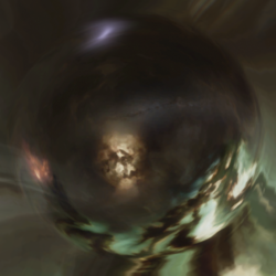
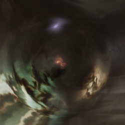
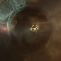
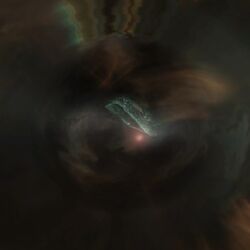
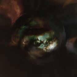
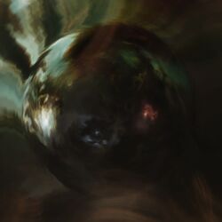
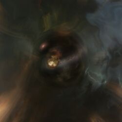
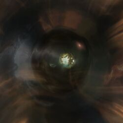
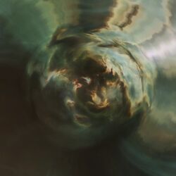
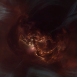
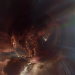
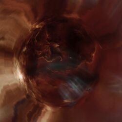
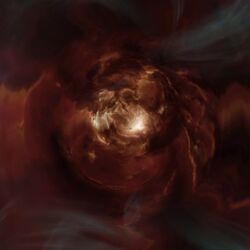
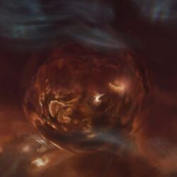
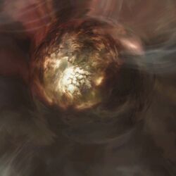
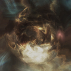
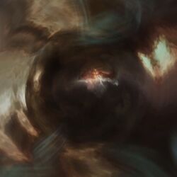
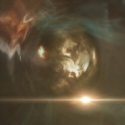
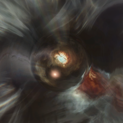
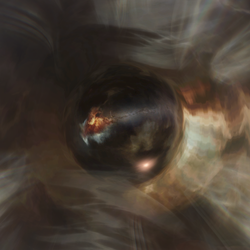
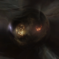
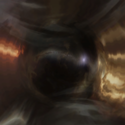
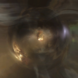
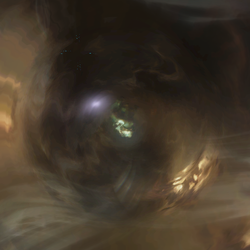
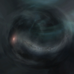
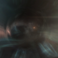
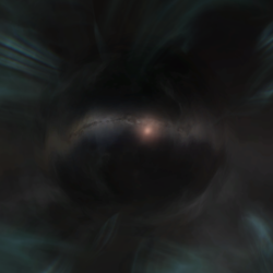
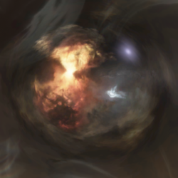
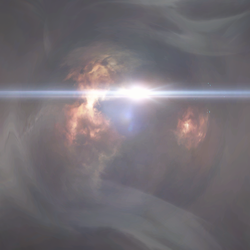
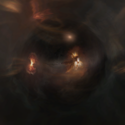
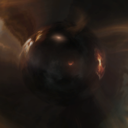
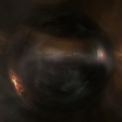
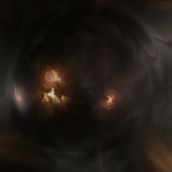
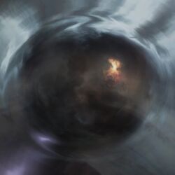
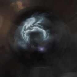
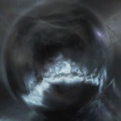
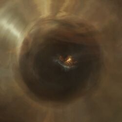
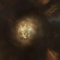
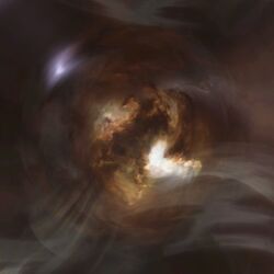
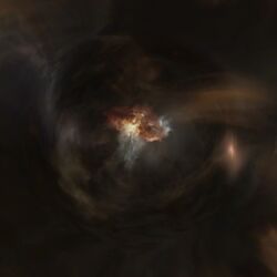
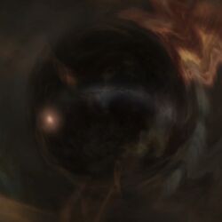
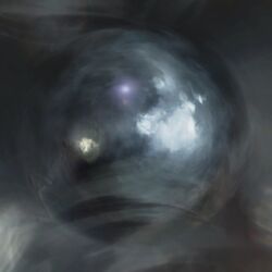
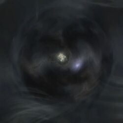
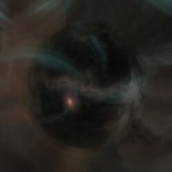
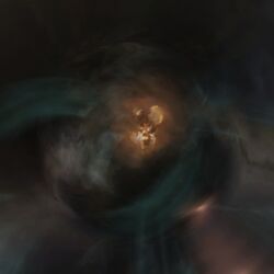
| | Wormhole eye region identification. |
| The '''overview''' is one of the most essential components of EVE's user interface, and is the primary means of viewing items in space. It is a customizable list of interactive entries, and can assist players with virtually every activity performed in space. Though it can be time-consuming to configure, the flexibility and effectiveness of a properly-configured overview justify the time spent. The primary weakness of the overview is that it is not in any way intelligent, so it is unable to anticipate a player's informational needs, nor can it alter its own configuration without player input. Because of this, the consequences of not setting up your overview properly could range from not being able to see a war target and subsequently getting destroyed, to firing on an ally because they appeared as a hostile, to being destroyed by NPC pirates that didn’t show up on the overview. The overview can be configured with multiple tabs and presets to allow easy access to multiple views and configurations.
| |
|
| |
|
| === Newbie Tips === | | {|class=wikitable style="width: 900px;background:#111111;text-align:center" |
| | !Wormhole eye |
| | !Region |
| | !Description |
| | |- |
|
| |
|
| '''CTRL''' is the default keyboard shortcut to target a selected object. You can do this from the Overview by first selecting the object on your Overview and then simply press the '''CTRL''' key.
| | | |
| | |Black Rise |
| | | |
| | |- |
|
| |
|
| '''Freezing your Overview'''
| | | |
| Hold down the '''CTRL''' key on your keyboard, and left click once with your mouse on an item in your overview to lock it. Holding down the control key will also freeze your overview in place, to prevent items from shuffling around based on the sorting order. This will help prevent you from locking the wrong targets by accident. When you are holding down the control key, all new items that appear on the overview will be added at the bottom of the list, and items that disappear from the grid will be shown in a faded text. Releasing the control key will re-sort your overview automatically.
| | |The Citadel |
| | | |
| | |- |
|
| |
|
| Double click an item on your overview to approach it.
| | |[[File:Wh_eye_The_Forge.jpg|250px|border]] |
| | |The Forge |
| | | |
| | |- |
|
| |
|
| <br>
| | |[[File:Wh_eye_lonetrek.jpg|250px|border]] |
| | |Lonetrek |
| | | |
| | |- |
|
| |
|
| === '''''<font color="yellow">IMPORTANT</font>''''' '''Review your Overview set-up''' ===
| |
|
| |
|
| Pilots should routinely review their overview set-up to ensure it's current, especially when Updates have been released. On occasion new entities get added to the game. Also, some updates and patches may bring other changes to how the Overview works.
| |
|
| |
|
| We will do our best to keep this guide current in a timely fashion.
| | |[[File:Wh_eye_essence.png|250px|border]] |
| | |Essence |
| | | |
| | |- |
|
| |
|
| <br> | | |[[File:Wh_eye_everyshore_1.png|250px|border]]<br>[[File:Wh_eye_everyshore_2.png|250px|border]]<br>[[File:Wh_eye_everyshore_3.png|250px|border]] |
| | |Everyshore |
| | | |
| | |- |
|
| |
|
| === Organizing your screen layout ===
| | |[[File:Wh_eye_Placid_1.jpg|250px|border]]<br>[[File:Wh_eye_placid_2.jpg|250px|border]] |
| | |Placid |
| | |On one side is the [?] and on the other side is The Cloud Ring. |
| | |- |
|
| |
|
| [[Image:KVVAQ.jpg|thumb|center|Screen Layout Sample]] | | |[[File:Wh_eye_sinq_Laison_1.jpg|250px|border]]<br>[[File:Wh_eye_sinq_Laison_2.jpg|250px|border]] |
| | |Sinq Laison |
| | | |
| | |- |
|
| |
|
| Before you even touch the overview itself, however, you should organize the rest of your interface. EVE is a game of communication and numbers - your screen layout should reflect this.
| | |[[File:Wh_eye_solitude_1.jpg|250px|border]]<br>[[File:Wh_eye_solitude_2.jpg|250px|border]] |
| | |Solitude |
| | |Notable feature is [?Gallente] with Cloud ring. On the other side[? amarr] is visible on the galactic plane. |
| | |- |
|
| |
|
| # Undock and find a safe place to sit. You will be sitting out in space for around half an hour. Immediately outside of a dockable station and away from the station exit is a good place to do this. (See [[#Editing Overview Settings While Docked|Editing Overview Settings While Docked]] below, for instructions on editing your overview without leaving the station.) '''Alternatively, do this on an alternate character on the same account.''' The changes will carry across to all characters ''on that account on the same computer''. <font color="red">This is strongly advised for characters in E-UNI during wartime.</font>
| | |[[File:Wh_eye_verge_vendor.jpg|250px|border]] |
| # Click the lines at the top left of the [[NeoCom]] panel --> ''Social'' --> ''Fleet''. Click the top left of the newly opened Fleet window and '''Form Fleet'''. You will see that you are now in a Fleet. You may need to reposition and resize the fleet window during fleet ops; sometimes you need it small and out of the way, other times you need to expand it to find pilots in the list.
| | |Verge Vendor |
| # Make your overview '''nice and big''' - it is your main source of information. You could have it running from top to bottom on the right side of the screen, with '''Selected Item window''' just above it, and the '''Drone Bay window''' just below it.
| | | |
| # During a fleet, you’re going to need to have chat windows open. If the FC runs squad chats, then you'll want that and the fleet chat open at once. I like to keep them on the left side of the screen in separate windows.
| | |- |
| # Another window you should have separated is '''Local chat'''. Local is very important in ascertaining who is in system with you. A lot of players like to have it narrowed to the smallest width. You may want to remove portraits from the local chat to make chatter easier to read. The local window is often positioned either running down the left side of the screen between the [[NeoCom]] and the chat channels, or just to the right of the chat channels. The more height your local window has, the easier it is to spot potential hostiles in a system.
| |
| # There is no six! (or is there..?)
| |
| # You should also leave space for your watch list, but you can only get that when you have other people in your fleet.
| |
| # Press escape and go to the '''General Settings tab'''. Under the '''Windows''' subheading, check '''Lock windows when pinned'''. This will ensure your overview and other windows don’t go anywhere.
| |
| # Pin your overview and any other windows of your choice. This will allow you to see through them.
| |
|
| |
|
| Remember that your interface should be set up the way it is most convenient for you - feel free to change your windows around once you work out what you want.
| |
|
| |
|
| '''''Hint -''''' You can move your ship and modules display to the left and right by holding shift and clicking on your capacitor and dragging. You can even move it to the top of your screen: Click the white arrow below the speedometer, then "Align Top" at the bottom of the menu which appears.
| |
|
| |
|
| '''''Another hint -''''' You can move your targeted objects around your screen as well. Notice that near the upper-left or upper-right corner of your targeted items (you will have to target something to see these), there is a very faint cross-hair. Click and drag that cross-hair around to change the location of your targets.
| |
|
| |
|
| '''''Yet another hint -''''' You can change the position of your ship view to move it out of the center of the screen. Hit ESC, and under Display and Graphics, adjust the camera center as desired.
| |
|
| |
|
| Now go to right click the 4-lined box on your '''Fleet tab''' and select '''Leave fleet''' . Your screen should be mostly set up for the next fleet op. Next time you go on an op, don’t forget to separate your squad and fleet chat windows and to add important fleetmates to your Watch List.
| | |[[File:Wh_eye_heimatar_.png|250px|border]]<br>[[File:Wh_eye_heimatar_2.png|250px|border]] |
| | |Heimatar |
| | | |
| | |- |
|
| |
|
| Now that we’ve gotten that down, let’s get onto the overview itself.
| | |[[File:Wh_eye_metropolis_1.jpg|250px|border]]<br>[[File:Wh_eye_metropolis_2.jpg|250px|border]] |
| | |Metropolis |
| | | |
| | |- |
|
| |
|
| <br>
| | |[[File:Wh_eye_Molden_Heath.jpg|250px|border]] |
| | |Molden Heath |
| | | |
| | |- |
|
| |
|
| = The Overview Settings =
| |
|
| |
|
| === Viewing Overview Settings ===
| |
|
| |
|
| To view all your overview settings, do the following: [[Image:Overview Settings Box.png|right|thumb|Accessing the Overview tab context menu.]]
| |
|
| |
|
| # Click on '''the menu icon, which appears as a 4-lined box''' ([[File:Overview-FourLines9.gif]]) on your '''Overview window'''.
| |
| # Click on '''Open overview settings'''.
| |
|
| |
|
| You should now see your Overview settings window, complete with six different settings tabs (not to be confused with the actual Overview tabs displayed on the Overview).
| | |[[File:Wh_eye_aridia.jpg|250px|border]] |
| | |Aridia |
| | |Single yellow nebula on dark background. |
| | |- |
|
| |
|
| {{clear}}
| | | |
| | |The Bleak Lands |
| | | |
| | |- |
|
| |
|
| ==== Editing Overview Settings While Docked ====
| | | |
| | |Devoid |
| | | |
| | |- |
|
| |
|
| [[Image:Overviewwhiledocked2.png|right|thumb|Enabling the ''Overview Settings'' shortcut key. (Note that the option has been renamed from ''Open Overview Settings'' to ''Overview Settings''.)]] | | |[[File:Wh_eye_domain_.png|250px|border]] |
| | |Domain |
| | | |
| | |- |
|
| |
|
| If you are docked, you can still view and alter your overview settings.
| | | |
| *<font color="yellow">Note:</font> You cannot load a preset except when in space, which is done by right-clicking on the tab on the Overview itself.
| | |Kador |
| | | |
| | |- |
|
| |
|
| To access your Overview Settings you can either add a shortcut or use a [[Slash Commands|slash command]].
| | | |
| | |Kor-Azor |
| | | |
| | |- |
|
| |
|
| ===== Command =====
| | |[[File:Wh_eye_Tash-Murkon_1.jpg|250px|border]]<br>[[File:Wh_eye_Tash-Murkon_2.jpg|250px|border]] |
| | |Tash-Murkon |
| | | |
| | |- |
|
| |
|
| # Go into any chat window.
| | |[[File:Wh_eye_khanid_1.png|250px|border]]<br>[[File:Wh_eye_khanid_2.png|250px|border]] |
| # Type in: '''/open overview settings'''
| | |Khanid |
| | |The Cauldron on one side, [?minmatar] on the other side over galactic plane. |
| | |- |
|
| |
|
| ===== Shortcut =====
| | |[[File:Wh_eye_derelik_1.png|250px|border]]<br>[[File:Wh_eye_derelik_2.png|250px|border]] |
| | |Derelik |
| | | |
| | |- |
|
| |
|
| # Press ''Escape''.
| |
| # Go to the ''Shortcuts'' tab.
| |
| # Within the ''Shortcuts'' tab, go to the ''Window'' sub-tab.
| |
| # Scroll down and you will find an ''Overview Settings'' option - set any keybind to this command.
| |
|
| |
|
| Now you can use this keybind even when in a station, and you will open the ''Overview Settings'' window.
| |
|
| |
|
| {{clear}}
| |
|
| |
|
| '''NOTE - This guide will cover optimizing overview settings in the next chapter. For now, follow along in your own overview and learn.'''
| |
|
| |
|
| === The Overview Tabs ===
| | |[[File:Wh_eye_genesis_1.png|250px|border]]<br>[[File:Wh_eye_genesis_2.png|250px|border]] |
| | |Genesis |
| | | |
| | |- |
|
| |
|
| This tab allows you to set up to eight different tabs, with eight different overview and bracket profile presets. You will want to take advantage of this. This lets you easily switch between different loaded presets for different situations. Ultimately it's up to you what you want to name each tab. If you import an Overview profile be sure you review these so that you can rename them for your own preferences.
| | |} |
|
| |
|
| Brackets are the icons you see in space for an item, such as squares for players, circles for planets, etc. Brackets can be toggled to "Show all, Stop showing all" (this will default to loaded preset bracket settings), and "Hide all brackets." Besides the default brackets showing for the tab's preset brackets, there will be times you won't want any brackets, and times when you want them all. Brackets can impact your performance.
| |
|
| |
|
| === The Tab Presets === | | == Outer regions == |
|
| |
|
| ==== Types ==== | | {|class=wikitable style="width: 900px;background:#111111;text-align:center" |
| | !Wormhole eye |
| | !Region |
| | !Description |
| | |- |
|
| |
|
| The types tab is where you select what you want to see on your overview. You can use this tab to select specific things (entities) - if you’re a veldspar miner, you might only want veldspar asteroids and NPC rats. If you’re a PvPer, you might only want ships on your overview, or maybe even just specific types of ships.
| | |[[File:Wh_eye_branch.png|250px|border]] |
| | |Branch |
| | | |
| | |- |
|
| |
|
| *'''Asteroid:''' Pretty self explanatory - all your different types of asteroids.
| | |[[File:Wh_eye_Cache_1.png|250px|border]]<br>[[File:Wh_eye_Cache_2.png|250px|border]] |
| *'''Celestial:''' All your large celestial objects - planets, moons, wormholes, and so on. Also contains beacons (cynosural fields), biomass (corpses), stargates, wrecks and containers.
| | |Cache |
| *'''Charge:''' Contains bombs, which can now be deployed by stealth bombers, but only in 0.0 space. These are very dangerous - always good to have them on your overview. It also includes probes, which are usually good to have checked, as having them on overview makes seeing them on d-scan easier.
| | | |
| *'''Deployable:''' Mobile warp disruptors, otherwise known as bubbles. These are the deployable type that get anchored in space. The other type are used by interdictors and heavy interdictors, and don’t show up on your overview.
| | |- |
| *'''Drone:''' All your various types of drones. Useful if you want to target drones of any kind, especially fighter drones.
| |
| *'''Entity:''' Some of your mission rats (NPC enemies), as well as a few useless things like billboards.
| |
| *'''NPC:''' CONCORD, some npc faction ships, and some rats.
| |
| *'''Orbitals:''' Orbital infrastructure, such as customs office.
| |
| *'''Planetary Interaction:''' Capsuler and Mercenary bases. Related to dust514.
| |
| *'''Ship:''' Player-owned ships. Usually you’ll have all of these selected, unless you want to target specific types of ships.
| |
| *'''Sovereignty Structures:''' Sovereignty related structures.
| |
| *'''Starbase:''' POS structures and modules - you might use these if you were attacking one, or living in one.
| |
| *'''Station:''' Pretty self-explanatory.
| |
| *'''Structure:''' Citadel - player created and owned station. This is added to the game at April 2016 via The Citadel Expension.
| |
|
| |
|
| There is a "Filter" text box which makes it easy to locate a specific thing(s) (entities) thus saving you from open and scrolling through the various sub-type categories.
| | | |
| <br>
| | |Catch |
| | | |
| | |- |
|
| |
|
| ==== States ====
| | | |
| | |Cloud Ring |
| | | |
| | |- |
|
| |
|
| In the States tab, you can further define what you want to see in the overview. Whilst the Types tab is pretty straightforward, some care has to be taken with the States tab.
| | | |
| | |Cobalt Edge |
| | | |
| | |- |
|
| |
|
| States are selected by toggling one of three radio buttons, each one corresponding to the three conditions located on the right of the States window.
| | | |
| | |Curse |
| | | |
| | |- |
|
| |
|
| *'''<font color="green">Always show</font>''' (column on the left) - Entities with this state will always be shown regardless of the display setting of additional states they may have.
| | | |
| *'''<font color="brown">Filter out</font>''' (column in the center)- Entities with this state will be filtered out unless they have additional states that are set to always show.
| | |Deklein |
| *'''<font color="sky blue">Show by default</font>''' (column on the right) - Entities with this state will be shown unless they have additional states that are filtered out.
| | | |
| | |- |
|
| |
|
| '''''IMPORTANT: States selection doesn't let you say what you want to see, rather it lets you say what you don’t want to see.'''''
| | | |
| | |Delve |
| | | |
| | |- |
|
| |
|
| ''If a player has an attribute that you '''haven’t''' selected, they '''won’t show up on your overview'''.''
| | | |
| | |Detorid |
| | | |
| | |- |
|
| |
|
| '''Example:''' You want to see a war target, so you select '''Pilot is at war with your corporation/alliance'''. You would think this would give you war targets on your overview, but it’s a bit more complicated than that.
| | | |
| | |Esoteria |
| | | |
| | |- |
|
| |
|
| Suppose that player also has a bounty on him. Since you haven’t got bounty checked, he won’t show up. You need to select all the attributes that a war target could possibly have in order to see war targets.
| | |[[File:Wh_eye_etherium_reach.png|250px|border]] |
| | |Etherium Reach |
| | |Ginnungagap dominates the view, on its side a smaller blue nebula. |
| | |- |
|
| |
|
| Additionally, the States tab and the Types tab interact which often leads to problems and confusion for newer players. For example, if you are setting up a drone preset where all you want to see are drones and nothing else [i.e. no ships, no rats etc.], many newer players will deselect everything in Types except for Drones and then deselect everything in States thinking that those attributes deal only with showing pilots - which is what you don't want in your Drones preset. The problem with this is that you will not see your Drones in the Overview because Drones belong TO pilots; in order to see your own drones, you must select "pilot is in your alliance" in the States tab. If you want to see the drones of your enemies, then you will also have to select "pilot is at war with your corporation/alliance" etc. Feel free to test this out with your own drones, you will be pleasantly surprised. The same principle applies if you're mining with jetcans, if you only select "Cargo Container" under Celestial in Types and deselect everything in States, nobody's cans will show up in your overview because by deselecting everything in States, you are not allowing your Overview to show cans that belong to pilots - and since all cans invariably belong to a pilot, none will thus show. This same principle applies to other objects like wrecks etc. because the States tab doesn't just show pilots, but it shows what those pilots own.
| | | |
| | |Fade |
| | | |
| | |- |
|
| |
|
| This is the trick to the overview, and (apart from bugs) the most common reason why players can’t see all the things they want to see.
| | | |
| | |Feythabolis |
| | | |
| | |- |
|
| |
|
| <br>
| | | |
| | |Fountain |
| | | |
| | |- |
|
| |
|
| ==== Save Button ====
| | |[[File:Wh_eye_geminate.png|250px|border]] |
| The '''Save''' button allows you to save the preset you currently have in the selected tab. It opens a dialogue box that reads "Type in label for the preset". In the text field you can enter the name you want for the preset. The field will auto populate the current name of the preset, which makes for quicker updating and editing of a preset. Note that this only saves the preset loaded to the currently selected tab for recall later and doesn't save the rest of your overview settings.
| | |Geminate |
| | |Ginnungagap is visible alongside a [?minmatar] nebula. |
| | |- |
|
| |
|
| | |[[File:Wh_eye_great_wildlands_1.png|250px|border]]<br>[[File:Wh_eye_great_wildlands_2.png|250px|border]] |
| | |Great Wildlands |
| | |Small Ginnungagap and [?]. |
| | |- |
|
| |
|
| <br>
| | | |
| | |Immensea |
| | | |
| | |- |
|
| |
|
| === The Appearance Tab ===
| | | |
| | |Impass |
| | | |
| | |- |
|
| |
|
| ==== Colortag ====
| | |[[File:Wh_eye_insmother_1.png|250px|border]]<br>[[File:Wh_eye_insmother_2.png|250px|border]] |
| | |Insmother |
| | |Small Ginnungagap and [?amarr]. |
| | |- |
|
| |
|
| Colortags allow you to set which tags appear or do not appear, and which tags have priority. Setting colortags correctly is important because they dictate which state you see. For example, if you have '''Pilot has a bounty on him''' set higher than '''Pilot is at war with your corporation/alliance''', you will only see the black skull bounty colortag rather than the red star war target colortag. The consequences of this could obviously be very bad.
| | | |
| | |The Kalevala Expanse |
| | | |
| | |- |
|
| |
|
| Also note that colortag settings also affect chat channels and brackets in space. Colortags can be set to blink; this is a good idea to make wartargets in local much more obvious, for example.
| | |[[File:Wh_eye_malpais_1.jpg|250px|border]]<br>[[File:Wh_eye_malpais_2.jpg|250px|border]] |
| | |Malpais |
| | |Small Ginnungagap and blue clouds. |
| | |- |
|
| |
|
| Another thing to remember is that changing these settings won’t dictate what you can and can’t see in your overview - you will still see all the things you dictated in the States tab. The only thing you’re changing here is how said things are displayed in your overview, in chat and in space.
| | | |
| | |Oasa |
| | | |
| | |- |
|
| |
|
| The outlaw tag will not display for a pilot with -5 or lower security status in the local chat window. A pilot will only show as outlaw in local if he has gained that tag for reasons other than -5 or lower security status; such as a criminal or suspect flag, or if he is flagged for aggression against yourself, or flagged for theft against your corp.
| | | |
| | |Omist |
| | | |
| | |- |
|
| |
|
| <br>
| | | |
| | |Outer Passage |
| | | |
| | |- |
|
| |
|
| ==== Background ====
| | | |
| | |Outer Ring |
| | | |
| | |- |
|
| |
|
| The Background tab allows you to change the background of items in your overview, as well as the background of icons in space. It doesn’t affect things in chat.
| | | |
| | |Paragon Soul |
| | | |
| | |- |
|
| |
|
| You can change the colour of the background of any pilot state. Generally, as backgrounds are quite distracting, many players keep them unchecked except for outlaws and war targets. In a situation where you want to be able to see neutrals or hostiles very clearly, such as in nullsec or wormhole space, it can be handy to keep all backgrounds checked.
| | | |
| | |Period Basis |
| | | |
| | |- |
|
| |
|
| You can also toggle flashing backgrounds. This is where the term “red flashy” comes from - players generally have war targets and outlaws set to a flashing red background. This is useful for highlighting certain pilots in your overview.
| | |[[File:Wh_eye_perrigene_falls.jpg|250px|border]] |
| | |Perrigen Falls |
| | | |
| | |- |
|
| |
|
| Like in the Colortags tab, backgrounds have priorities. If a pilot fulfills two or more criteria, the highest ranked one will take priority.
| | |[[File:Wh_eye_providence_1.jpg|250px|border]]<br>[[File:Wh_eye_providence_2.jpg|250px|border]] |
| | |Providence |
| | | |
| | |- |
|
| |
|
| <br>
| | | |
| | |Pure Blind |
| | | |
| | |- |
|
| |
|
| === The Columns Tab ===
| | | |
| | |Querious |
| | | |
| | |- |
|
| |
|
| Columns let you select which columns you want to see in your overview. Some of them are pretty useless, so you obviously don’t want those columns cramping your style.
| | |[[File:Wh_eye_scalding_Pass.jpg|250px|border]] |
| | |Scalding Pass |
| | | |
| | |- |
|
| |
|
| *'''Icon:''' This is the object’s icon, useful for quickly seeing the difference between a stargate and a station, or a war target and a corp member.
| | | |
| | |The Spire |
| | | |
| | |- |
|
| |
|
| *'''Distance:''' The object’s distance from your ship.
| | |[[File:Wh_eye_stain_1.jpg|250px|border]]<br>[[File:Wh_eye_stain_2.jpg|250px|border]] |
| | |Stain |
| | | |
| | |- |
|
| |
|
| *'''Name:''' The name of the object, be it a player name, the name of a station, or the name of a stargate or another item.
| | | |
| | |Syndicate |
| | | |
| | |- |
|
| |
|
| *'''Type:''' Shows what type of ship a pilot is flying, which is a very useful thing to know.
| | | |
| | |Tenal |
| | | |
| | |- |
|
| |
|
| *'''Tag:''' The tag that a fleet commander (FC) has assigned to an object. Useful when primary and secondary targets are called, although an FC will usually just shout out the name over Mumble. Mostly used for shooting rats, where the FC wants pilots to destroy enemies in a certain order, but doesn’t want to have to call out each target.
| | | |
| | |Tenerifis |
| | | |
| | |- |
|
| |
|
| *'''Corporation and Alliance:''' A pilot’s corporation and alliance.
| | |[[File:Wh_eye_tribute.jpg|250px|border]] |
| | |Tribute |
| | |The Jove nebula is visible next to bright blue nebula. |
| | |- |
|
| |
|
| *'''Faction and Militia:''' Used in Factional Warfare.
| | |[[File:Wh_eye_Vale_of_the_Silent.jpg|250px|border]] |
| | |Vale of the Silent |
| | |The Jove nebula is visible over the galactic plane. |
| | |- |
|
| |
|
| *'''Size:''' The object’s size in meters.
| | | |
| | |Venal |
| | | |
| | |- |
|
| |
|
| *'''Velocity:''' The object’s general velocity. Very useful in PvP to see enemy ship speeds to determine if they are kiting your fleet, or if they've been tackled by scrams and webs to slow them down, etc.
| | |[[File:Wicked_Creek_1.jpg|250px|border]]<br>[[File:Wicked_Creek_2.jpg|250px|border]] |
| | |Wicked Creek |
| | | |
| | |- |
|
| |
|
| *'''Radial Velocity:''' How fast an object is traveling, and whether it is traveling towards or away from you.
| | |} |
| | |
| *'''Transversal Velocity:''' How fast an object is traveling perpendicular to you. In theory useful for gunnery pilots in gauging whether a target can be hit or not, and potentially valuable for frigate and interceptor pilots trying to avoid being hit by guns. An object with a faster transversal velocity, at a specific distance, will be harder to hit, and vice versa.<br/>Angular velocity is usually much more useful as it translates directly into turret tracking, since it takes into consideration the distance to the object. Angular velocity is the most valuable tab for gunnery pilots.<br/>Transversal velocity could still be useful in trying to gauge how the angular velocity could change if the movement direction of the object changes. (e.g.: an object with low transversal velocity could quickly increase its angular velocity by changing its direction to be perpendicular to yours. But if its transversal velocity is already close to its velocity, then it's already moving perpendicular to you, and its angular velocity can only decrease)
| |
| | |
| *'''Angular Velocity:''' is an object’s speed relative to you, measured in radians per second. This means that angular velocity takes distance from a target into account, a very important factor when trying to hit something. Even if a ship has a high transversal velocity, it may still have a very low angular velocity because it is far away; meaning it might still be easy to hit. Basically, if the number in the angular velocity tab is lower than your tracking speed you can hit targets that are the right size for your guns. If the target's angular velocity is higher than your tracking speed, then you will miss targets that are the right size for your guns. See [[Turret Damage#Target_size|Target size]].
| |
| | |
| <br>
| |
| | |
| === The Ships Tab ===
| |
| | |
| The Ships tab lets you customize what you see when you mouse over an object in space. It also lets you customize the order information is shown in, and the brackets used on either side of each bit of information. Again, some bits are useful, and some bits are not. Ship Name, for example, is rarely useful, whereas Ship Type is very useful. This information can be useful when you are looking at a battle while zoomed out, if you want to see all pertinent information when you mouse over different ships.
| |
| | |
| <br>
| |
| | |
| === The Misc Tab ===
| |
| | |
| The Misc tab allows you to reset all of your overview settings and start from scratch. You will want to consider resetting all of your overview settings prior to importing a new overview profile. Be sure to export or save in-game your current settings prior to doing this.
| |
| | |
| It also has the option of moving objects that are mentioned in broadcasts to the top of an overview. This can be useful in fleet operations when the FC broadcasts an align command, or the like. The relevant stargate/object would then move to the top of the overview.
| |
| | |
| Brackets and target indications are set here as well.
| |
| | |
| The Import and Export Overview Settings buttons are used to save or import your saved profiles from your computer.
| |
| <br>
| |
| | |
| === The History Tab ===
| |
| | |
| This tab lists the last 15 overview profiles you have loaded.
| |
| | |
| There is also a ‘restore’ button, which will restore your overview back to what it was before you loaded the last overview profile, which can be handy if some joker links you a bad overview profile. Please note that this history is only stored in your local settings for that user so we recommend storing profile links you want to keep around in more permanent places such as the in-game notepad or character bio. See [[Overview_Guide#Saving_and_sharing_your_Overview_Profile|"Saving and Sharing your Overview Profile"]] below for further details.
| |
| | |
| <br> The next section will show you how to set different presets and optimize your overview for different situations.
| |
| | |
| <br>
| |
| | |
| == Setting Up Your Overview ==
| |
| {{main|Installing the EVE University Overview}}
| |
| | |
| == Setting Up Bracket Presets ==
| |
| | |
| Brackets are the little icons you see in space, depicting different objects. Sometimes having too many of them can cause lag, but they are often useful.
| |
| | |
| There are occasions on which you might want your brackets to show different things than are on your overview. For example, bracket settings with drones selected, where my main overview settings do not show drones. This is because there are often swarms of drones about, which can quickly clog up one’s overview.
| |
| | |
| One example of a time you might want to see drone brackets in space is in missions. You want to warp off, but you don’t know whether your drones are still out. If you have drone brackets set, you can easily see when your drones are no longer in space. Additionally, you can see when someone has drones attacking you in PvP. This can be very useful.
| |
| | |
| Again, bear in mind that brackets can cause lag - use them at your own risk.
| |
| | |
| To create a bracket setting:
| |
| | |
| #Load the particular preset you want to create bracket settings for. For example, you might want drones on your wormhole setting, so you would load '''6 - Wormhole''' .
| |
| #Add or remove items you do or don’t want to see in space (eg. drones).
| |
| #Save the setting as something you’re going to recognize as a bracket setting. For example, you might save your setting as '''6 - Wormhole B''' .
| |
| | |
| See the next section to see how to set assign bracket presets.
| |
| | |
| <br>
| |
| | |
| == Assigning the Tabs and Brackets ==
| |
| | |
| '' You may have up to 8 active tabs to assign Overview presets to.''
| |
| | |
| | |
| #Go to the '''Overview tabs tab''' .
| |
| #Under the '''Tab name''' column , enter the following minimum recommended five items:
| |
| #*'''PvP'''
| |
| #*'''PvP Travel'''
| |
| #*'''Situational''', '''Missions''', '''Mining''' or '''Wormhole''' ''(choose whichever one you use, and up three tabs used)''
| |
| #*'''Fleet'''
| |
| #*'''Pod Saver'''
| |
| #Under the '''Overview profile column''' , assign each tab its respective overview profile, i.e. assign '''2 - PvP Travel''' to the '''PvP Travel tab''' and so on.
| |
| #Under bracket profiles, do the same ( '''2 - PvP Travel''' to '''PvP Travel tab''' and so on), '''unless you want to set your bracket profiles to something different''' . If you have set up bracket profiles as per the previous section, assign them here (eg. assign '''6 - Wormhole B''' as a bracket profile for '''6 - Wormhole''' ).
| |
| #Click '''Apply''' at the bottom of the window.
| |
| | |
| You should now have five to eight different tabs with different overview presets, that you can switch-out as needed. During war, you can switch the Missions/ Mining tab to the '''PvP Travel without neutrals''' configuration. This tab can be used if you need to fight in a trade hub that has a lot of neutrals cluttering the overview. However, be warned that you cannot see neutral remote reppers if you use this tab, so it is often preferable to fight with the pvp travel tab and sort by alliance name with the arrow pointing down (or corp name if the war targets are not in an alliance).
| |
| | |
| <br>
| |
| | |
| == Using All Brackets ==
| |
| | |
| EVE isn’t a very system-intensive game, and some people have computers that can easily handle the game on max settings. If your system can handle it, you can select '''show all brackets''' in the overview options for each tab. This will let you see friendly and hostile ship brackets on the field as well as neutrals and drones. Having all brackets turned on can help you identify an on-grid fleetmate to use as a warp-in. Many players fly with all brackets turned on, and it is recommended to do so if your system can handle it. Zooming out the camera with all brackets turned on will give you a good view of what's happening on the battlefield.
| |
| | |
| You can press '''Option + Z ''' (for Mac) or '''ALT + Z''' (for PC) turn on all brackets.
| |
| | |
| In very large fleet fights, it is inadvisable to have brackets turned on, as this will cause server-side lag when there are hundreds of players shooting at each other in the same system. Most nullsec corps will have instructions for their members on how to minimize lag during large encounters.
| |
| | |
| <br>
| |
| | |
| == Using the Tag Column ==
| |
| | |
| The Tag feature allows you to assign a number or letter to individual ships or objects in space which will be visible in the Tag column of the overview. The tag will remain assigned to the object until it is destroyed, you dock in a station, or enter a jump gate. This is useful for marking trigger ships during missions, marking trigger ships and kill order in wormhole sleeper sites, prioritizing PvP targets, marking NPC convoy ships for attack (see [http://www.eve-wiki.net/index.php?title=Guide:Attacking_Convoys EVE Wiki Attacking Convoys Guide] for more details), or any other activity for which you may need to quickly identify specific objects for a fleet. Only a fleet member in a command position can mark tags.
| |
| | |
| <br>
| |
| | |
| == Tagging Process ==
| |
| | |
| The Tag option is only available while you are a member of a fleet, and in a command role (i.e. FC, WC, or SC). If you are alone, you may simply form a fleet with yourself (your default role with be FC).
| |
| | |
| To tag an object, simply right-click, select "Tag" from the context menu, and you will be given a choice of numbers or letters. Pick the number or letter you wish to use and you are done.
| |
| | |
| <br>
| |
| | |
| = Advanced Tips =
| |
| | |
| == Colour Tabs and Colour Brackets ==
| |
| | |
| The overview Tabs and in-space bracket text attributes (size, color, bold) can be edited using following the procedures found on this wiki page: [[Overview manipulation]]
| |
| <br>Editing the Tabs and in-space bracket attributes will allow for quicker identification of items of interest.
| |
| | |
| <br>
| |
| | |
| == Distance ==
| |
| | |
| It can be helpful to know conversions from AU to KM when using various overview presets and the directional scanner. You can keep a note with distance information in your notepad, to be able to quickly copy and paste into the d-scan range field.
| |
| | |
| 1 au = km 149 598 000<br> 3 au = km 448 794 000<br> 5 au = km 747 990 000<br> 7 au = km 1 047 186 000<br> 9 au = km 1 346 382 000<br> 11 au = km 1 645 578 000<br> 13 au = km 1 944 774 000<br> 14 au = km 2 094 372 000<br> 14.35 au = km 2 147 483 647<br> 32 au = km 4 787 136 000<br> 48 au = km 7 180 704 000
| |
| | |
| <br>
| |
| | |
| == Variant Presets ==
| |
| | |
| === PvP Travel + Blues ===
| |
| | |
| You can make a variant of the PvP Travel preset that also shows pilots in good standing to the Uni. Check '''Pilot is in your corporation''', '''Pilot is in your alliance''', '''Pilot has excellent standing''', '''Pilot has good standing'''.
| |
| | |
| This can be helpful to see what kind of friendlies are flying around. This will not show fleetmates. Fleetmates that disconnect from the game will appear on your overview while they warp off, which makes noticing them easier.
| |
| | |
| Adding blues to your overview will show criminally flagged blues, like pirates we have a non-aggression pact (NAP) with. If you show blues, you must be very careful to check icons of outlaws so that you do not shoot blue pirates.
| |
| | |
| <br>
| |
| | |
| === PvP Travel + Planets ===
| |
| | |
| Having the planets on overview can sometimes be useful. This can let you see which planets are in d-scan range (approx 14.35 AU). Sometimes used by lowsec PvP fleets to see where the ships on d-scan could be located.
| |
| | |
| <br>
| |
| | |
| === PvP Travel + POS ===
| |
| | |
| Its sometimes good to know if there are control towers in a system, especially in wormholes, and in lowsec when trying to find enemy ships. Control Tower can be found in the Filter > Types tab in the Structures category. Control Towers are more commonly known as POS, or Starbase.
| |
| | |
| <br>
| |
| | |
| == Militia column ==
| |
| | |
| The Militia column can be hidden in the right side of the screen if you don't need that information. It is mostly used by lowsec PvP fleets to identify Faction Warfare pilots, some of which are unlikely to aggress Uni fleets (although some FW corps will happily take a criminal flag to shoot down Uni targets of opportunity).
| |
| | |
| <br>
| |
| | |
| = Additional Information =
| |
| | |
| === How to Check For War ===
| |
| | |
| Click the Corporation button on your [[NeoCom|NeoCom]]. Select the Wars tab. Select the Our Wars subtab.
| |
| | |
| To view the status of someone else's wars, if you are in a different corporation:
| |
| | |
| As above, but choose the Other Wars subtab. Click the Select button at the bottom of the window. Enter the name of the corporation or alliance you're interested in.
| |
| | |
| Note that a corporation which is a member of an alliance cannot be viewed by itself; you have to search for the alliance. The "EVE University" corporation is a member of the "Ivy League" alliance.
| |
| | |
| The war list will tell you when each war began, whether it's live or in warmup ("Can Fight"), and when it was terminated ("Retracted") if in cooldown. The cooldown period will end 24h after the time listed for retraction.
| |
| | |
| <font color="red">'''It is your responsibility to check for war. Check your mail notifications every day if you log in. If you're not sure if there is a war, or if it is live, check the [[NeoCom|NeoCom]].'''</font>
| |
| | |
| <br>
| |
| | |
| === Feedback ===
| |
| | |
| If you wish to give feedback or suggestions concerning this guide, EVE mail or send a private message on the EVE University forum to the [http://wiki.eveuniversity.org/Eve_University_Management#Wiki_Manager Wiki Manager].
| |
| | |
| <br>
| |
| | |
| === A Note on .xml Export File Requests <font color="yellow"> (Does not apply to .yaml importing or exporting) </font> ===
| |
| | |
| {{expansion past |* With the "Hyperion" release .xml is no longer the format in which Overviews are exported and imported. [http://community.eveonline.com/news/dev-blogs/sharing-is-caring/ CCP] for the time being will continue to let it be possible to import old .xml files, but that is something they want to remove so we encourage you to re-export those settings in a .yaml file. <font color="green">'''Note:'''</font>The YAML import/export works as intended across different machines and clients where the XML import/export had issues.
| |
| | |
| Please don't ask, it's never going to happen. Okay, so some have decided to provide exported .xml files for import. There are some things you should be aware of with .xml file importing.
| |
| | |
| <font color="red">'''Only using the export/import feature can lead you to shoot friendly pilots and other complications. Always go through the entire overview setup process when configuring a new account or a new computer.'''</font>
| |
| | |
| The XML file only has part of the necessary configuration contained within it. This is problematic if you wish to replicate your overview setup between two computers, or two EVE instances on the same computer, because you have to do a lot of manual configuration after the XML file import anyway. Specifically, the Appearance and Column tabs are not exported when you export your overview settings.}}
| |
| | |
| <br>
| |
| | |
| === Overview XML/.YAML manipulation ===
| |
| | |
| Any XML exported overview can be edited to customize the appearance of the ship information in space. See: http://forum.eveuniversity.org/viewtopic.php?f=29&t=49396
| |
| | |
| * the ship information is in the shipLabels section
| |
| * if you want to add or remove line breaks look for: " "
| |
| * the color format requires an alpha channel: 0x8080BF won't work, but 0xFF8080BF does
| |
| | |
| <br>
| |
| | |
| === Overview Bugs ===
| |
| | |
| It can happen that blue pilots show up as neutral in some circumstances. This can be especially problematic in nullsec with NBSI (Not Blue, Shoot It) alliances. If the '''Corporation''' and '''Alliance''' columns in the overview are blank, it is likely a bug. Sometimes the Corporation or Alliance ticker name still display in the overview despite showing an incorrect standing colortag. Right-clicking the pilot in the overview and selecting '''show info''', then clicking the pilot's portrait will show the pilot info and the correct standing will be displayed in that window.
| |
| | |
| It can happen that entire blue fleets show up as neutral in some circumstances (perhaps due to lag), while some of them still display Corporation or Alliance information in the overview columns. Being familiar with blue ticker names can be helpful, as well as doing a '''show info''' to verify.
| |
| | |
| <br>
| |
| | |
| = Overview Packs =
| |
| Before you proceed : {{Color|wheat|It is highly recommended that you follow the guide to build your own overview pack above because it will help you understand how the Overview settings, which space object falls into what category and how the Overview in whole works.}}
| |
| | |
| {{important note box| With the "Hyperion" release .yaml has replaced .xml as the format for exported Overview files. Please note that .xml imports will be supported for a limited time as per [http://community.eveonline.com/news/dev-blogs/sharing-is-caring/ CCP]}}
| |
| | |
| Any Overview pack that you choose to download then upload to your client should undergo extensive double-checking and possible re-working of your Overview. There are known issues with uploading to a different client or computer. See above.
| |
| | |
| Overview packs are '''pre-built set of overview profiles''' and on most cases, include their own set of settings, such as bracket display and labeling. This allow players to quickly import several overview profiles at once. There are also many other features which can be included on overview packs in comparison to your basic overview, depending on each of the overview packs currently available in public, two of the most common features most overview packs promoted are :
| |
| *Customizing how the overview brackets are displayed
| |
| *Customizing how the overview tabs are displayed
| |
| Bear in mind that overview packs are not official products made by CCP, they are custom-built, third-party release. Until today, overview pack is not a sanctioned product nor it is considered an exploit, so it is fairly safe to use until CCP says otherwise.
| |
| | |
| There are also several other advantages of using or releasing overview packs. One worth mentioning is that some overview packs were designed with a lot of careful considerations and many standards applied. This is especially important in some corporations, big alliances or coallitions. For instance, many of the overview packs may release set X profiles which is used on important scenarios and in turn used by many members of certain organizations; there are also the case of standardization across these profiles, while building your own overview can be good or better on some cases, using the same overview pack across many players at once enables you to follow and issue commands or intel with the knowledge that the other person who listen or giving those intel actually have the same overview setup as yours.
| |
| | |
| == Commonly Known & Used Overview Packs ==
| |
| Below are some of the widely known overview packs available. (Note: These Overview Packs are not to the EVE UNI standards and are for experienced players only)
| |
| | |
| *[https://gitlab.com/Arziel/Z-S-Overview-Pack/ Z-S Overview] (GitLab) ('''<font color="green">Up to Date</font> April 2019''')
| |
| : An all round Modular Overview Pack focused on all aspects of EVE's gameplay, allowing the use of generalized new-player friendly and/or very specific profile presets for tactical advantage.
| |
| : Available in-game in "'''Z-S Overview'''" Channel and Mailing List.
| |
| *[https://www.reddit.com/r/Eve/comments/ar406g/sarashawa_overview_pack_v_105_released/ SaraShawa Overview Pack] (Reddit Post) ('''<font color="green">Up to Date</font> April 2019''')
| |
| : A PvP-focused overview pack, fundamentally an update and expansion on Sarah's Overview Pack.
| |
| : Available in-game in "SaraShawa-Overview" Channel.
| |
| : It contains a massive list of pre-set overview settings that you can load on the fly, allowing for great versatility.
| |
| *[http://forums.ponywaffe.org/topic/1697-sarahs-overview-pack%e2%84%a2-rel-021/ Sarah's Overview Pack] (Site) (<font color="red">Outdated</font> '''Rhea Release''')
| |
| : A PvP oriented overview pack with many pre-built overview profiles included built around the quick-switch design.
| |
| *[http://eve-files.com/dl/254993 Blitz Kotare Overview Pack] (DDL) (<font color="red">Outdated</font>)
| |
| : An all round overview pack.
| |
| *[http://community.eveonline.com/ingameboard.asp?a=topic&threadID=1324148 Louis deGuerre Overview Pack] (Site) (<font color="red">Outdated</font>)
| |
| : A fairly small and compact overview pack.
| |
| *[https://dl.dropbox.com/u/4822323/aryth.xml Aryth's Overview Pack] (DDL)
| |
| : A PvP oriented overview pack.
| |
| *[http://community.eveonline.com/ingameboard.asp?a=topic&threadID=1285028 Brother Benthor's Overview Pack] (Site) (<font color="red">Outdated</font>)
| |
| : An all round overview pack, with many profiles included.
| |
| | |
| Please note that most of these are outdated and any upload you do to your game client may require extensive double-checking and re-working of your Overview.
| |
| | |
| = Conclusion of the Guide =
| |
| | |
| Congratulations! You’ve set up your overview.
| |
| | |
| Don't hesitate to customize it to your liking once you understand how it works.
| |
| | |
| Pre-set E-Uni overviews are available in the in-game channel <font color="yellow">Overview (EVE Uni)</font>
| |
| <br>
| |
| | |
| [[Category:User_Interface]]
| |
