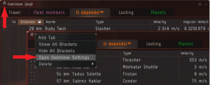
Overview manipulation
Overview manipulation
This page contains information on what's possible to manipulate when it comes to the overview in EVE Online as well as some examples of how to go about it. The overview is essential in showing you what's happening around you. More information about the overview in general and how to set it up according to EVE University standards can be found on the Overview Guide page.
What can you manipulate?
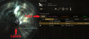
While you can make any number of changes to the overview through the .yaml file, almost all of the things that can be changed ingame is much easier and more reliable to change ingame, with the exception of changing colours, font sizes, styles etc of the tab names and the ship labels / brackets in space.
Tab appearance
The Overview Tabs settings ingame will allow you to add html-formatting, but most people prefer to edit this outside the client anyway due to the highly restrictive input fields. It's much easier to edit those values in a proper text-editor than trying to do it in a tiny little window that shows but a few letters at a time.
Ship labels / brackets in space
Whenever you select a target or hover over a bracket in space you'll get some information about the entity. By manipulating the .yaml file you can customize this to show the information in different colours, font sizes or even with personalized linebreaks etc. These changes will affect your combat notifications as well and show the parts regarding players and player owned entities appropriately formatted, which is an added bonus that leads to improved readability of onscreen combat messages. If you decide to add manual linebreaks or other formatting code, be sure to check that the onscreen combat messages are still readable.
You can only change the appearance of players and player items (like mobile depots) this way, celestials, anomalies, NPC ships etc will have their default appearance no matter what you do.
How do you go about manipulating the overview?

The easiest way to manipulate your overview is to save your current overview and then export it into your documents folder. That way you can open the overview file in a text editor and quickly view your changes ingame by saving the file and importing the new settings. That way you can easily tinker with your overview until you have it just the way you like it.
Exporting your current settings
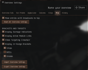
Open your Overview Settings window and go to the Misc tab. At the bottom of the tab you'll see two button, Import Overview Settings and Export Overview Settings. It's highly recommended that you start by making a backup of your settings by exporting them into one file first, before making another export with another name, with the intention of using the second copy as a work-in-progress file.
Location of your overview files
The files will end up in your documents folder along with screenshots, chatlots etc (not to be confused with the application data folder where your other settings are stored). The folder is created automatically the first time you export your settings, so normally you won't have to do that yourself.
Where this folder is depends on your operative system.
| OS | Location of the folder |
|---|---|
| In Windows the files will be in your "My documents" folder. %userprofile%\documents\EVE\Overview | |
| The Macintosh users the files will be in the following folder: <username>/Library/Application Support/EVE Online/p_drive/My Documents/EVE/Overview |
Editing the overview file
The overview is saved in the .yaml file format and can be edited in pretty much any kind of text-editor, like the commonly used Notepad++, but of course the standard notepad editor that comes comes with Windows works as well. Simply right-click the file and open it with your favourite text-editor to start editing. The majority of the changes you're likely to make (tab and label edits) will be at the very end of the file.
File structure
The overview used to be stored in .xml files where you had to hide brackets, tags and other things by rewriting them as < or > for it to parse correctly by the game engine. With the new .yaml files you can write plain html-code and it'll be parsed just fine.
Attributes and values are split across individual lines, with - markups identifying and grouping the variables. Here's an example with colour-coded comments:
|
<pre<noinclude></noinclude>> tabSetup: -- This identifies the start of the code handling tabs. - - 0 -- First tab. - - - bracket
- null
- - name
- <b>. PvP .</b> -- This is the value for 'name', which is the label for the tab.
- - overview
- 1a - pvp + drones -- This is the name of the setting that's loaded into this tab.
- - 1 -- Second tab. - - - bracket
- null
- - name
- <b>. PvP Travel .</b>
- - overview
- 2 - pvp travel
-- Skipping to the next interesting part. shipLabelOrder: -- This determines the order of the different labels. - ship type -- If state is set to 1 for ship type, it'll show first. - pilot name -- If state is set to 1 for pilot name, it'll come second etc. - corporation - alliance - ship name - null shipLabels: -- This identifies the start of the actual code handling ship labels, the order isn't important. - - null -- This is the last setting that ingame only has a pre-box and no post-box. - - - post -- Anything put below the 'post' line will be added after the label/tag. - -- This particular label doesn't use the post-attribute. - - pre -- Anything put below the 'pre' line will be added before the label/tag. - '[' -- This only shows if the player has a corporation ticker. - - state -- Attribute telling us if the label should show (1) or not (0). - 0 -- This label will not be shown since it's set to 0. - - type -- The type of the label. - null - - alliance -- This is the code for the alliance tag, like <IVY>. - - - post
- '>' -- This adds the closing bracket after the alliance ticker.
- - pre
- '<' -- This adds the opening bracket before the alliance ticker.
- - state
- 1 -- This label will be shown since it's set to 1.
- - type
- alliance -- This is the alliance label (not everyone will have one).
-- Etc, etc. </pre<noinclude></noinclude>> |
Reloading settings while in space
You can easily purge or load new settings while, but in order for the new settings to take full effect (especially ship labels) you'll need to load a tab that doesn't have ships or player owned entities on them (to sort of "purge" them from memory) and then swap back to a tab that does show them. Once you do that, the new settings will be in full effect.
The podsaver tab is excellent for this, as it shouldn't contain any player entities, so swapping to the podsaver and back everytime you reload your settings should be enough.
Example
This is an example of one of the pre-saved overviews that were available at the time of writing this guide. On the left is the unedited version of the overview, on the right is the code with the changes highlighted in blue that enables the colour-coding and font-changes.
The changes are simple html-coding using normal <color></color> and <font></font> tags, but can include things like linebreaks <br>, bold <b></b> etc. For colours, use the 0xFFRRGGBB format, so if you wanted the colour green you'd use 0xFF008000. You can also use various ASCII- and HTML-codes, like rooks ♜ ♖, kings ♚ ♔, horses ♞ ♘, airplane ✈, skull ☠, yin and yang ☯, stars ★ ☆ or whatever else you might find. Not all symbols will work, or even turn out the way you thought they would, but you can easily just check that out in a chat window beforehand.
See Web colors, ASCII Codes or Symbols for inspiration.
Tab appearance
These changes are possible to do ingame, albeit tricky since the window and editing fields are extremely limited. But the game will accept and change these values from inside the game, so there's technically no need to export and edit the files if this is all you want to edit.
In this example I removed the bolding and simply made the font a little larger, because I have my interface scaled to 90% and my context-font set to 11 (which the tabs won't use for some reason). I also added some colours and removed the dots and just used regular space to widen some of the shorter-named tabs and rearranged the tab order itself.
| Original version | Modified version |
|---|---|
tabSetup:
- - 0
- - - bracket
- null
- - name
- <b>. PvP .</b>
- - overview
- 1a - pvp + drones
- - 1
 - - - bracket
     - null
   - - name
     - <b>.  PvP Travel  .</b>
   - - overview
     - 2 - pvp travel
- - 2
- - - bracket
- null
- - name
- <b>. Situational .</b>
- - overview
- 3 - missioning
- - 3
- - - bracket
- null
- - name
- <b>. Fleet .</b>
- - overview
- 7 - fleetmates
- - 4
- - - bracket
- null
- - name
- <b>. Pod Saver .</b>
- - overview
- 5 - pod saver
|
<pre<noinclude></noinclude>> tabSetup: - - 0 - - - bracket
- null
- - name
- <color=0xffffffff><font size=11> Travel </font></color>
- - overview
- 2 - pvp travel
- - 1 - - - bracket
- null
- - name
- <color=0xffff99ff><font size=11> Fleet members </font></color>
- - overview
- 7 - fleetmates
- - 2 - - - bracket
- null
- - name
- <color=0xffff6600><font size=11> It depends!™ </font></color>
- - overview
- 3 - missioning
- - 3 - - - bracket
- null
- - name
- <color=0xffffffff><font size=11> Looting </font></color>
- - overview
- 5 - looting
- - 4 - - - bracket
- null
- - name
- <color=0xff00ff33><font size=11> Planets </font></color>
- - overview
- 5 - pod saver
</pre<noinclude></noinclude>> |
Ship labels
The format of this is pretty straight forward. The shipLabels: tag marks the beginning of the settings for labels and the - indentations breaks up the various attributes. The pre attributes add stuff before the label while the post attribute add stuff after the label. The state attribute is a simple integer showing if it's enabled (1) or disabled (0) while the type attribute is the name of the attribute. The value for each attribute ends up on the line below, after the - indentation. Text doesn't have to be wrapped in ''s, but can if you feel that makes it easier to read.
Depending on the order of these labels and the fact that some labels might not show all the time (not all corporations belong to an alliance and not all players will have a corporation tag), take a few minutes to decide if and where you'd your space. In this example, I moved the space from after the player name to before the corporation ticker, so that if the player isn't in a player corporation I won't get a superfluous space added.
| Original version | Modified version |
|---|---|
shipLabels:
- - null
  - - - post
      - ''
    - - pre
      - '['
    - - state
      - 0
    - - type
      - null
- - alliance
  - - - post
      - '>'
    - - pre
      - '<'
    - - state
      - 1
    - - type
      - alliance
- - corporation
  - - - post
      - ']'
    - - pre
      - '['
    - - state
      - 1
    - - type
      - corporation
- - pilot name
  - - - post
      - ' '
    - - pre
      - ''
    - - state
      - 1
    - - type
      - pilot name
- - ship name
  - - - post
      - ''''
    - - pre
      - ''''
    - - state
      - 0
    - - type
      - ship name
- - ship type
  - - - post
      - ')'
    - - pre
      - '('
    - - state
      - 1
    - - type
      - ship type
|
<pre<noinclude></noinclude>> shipLabels: - - null - - - post - '' - - pre - '[' - - state - 0 - - type - null - - alliance - - - post - ')</color>' - - pre - ' (' - - state - 1 - - type - alliance - - corporation - - - post - ']</color>' - - pre - ' [' - - state - 1 - - type - corporation - - pilot name - - - post - '' - - pre - '' - - state - 1 - - type - pilot name - - ship name - - - post - '''' - - pre - ' ''' - - state - 0 - - type - ship name - - ship type - - - post - '</color> ' - - pre - '' - - state - 1 - - type - ship type </pre<noinclude></noinclude>> |

