Difference between revisions of "Overview Settings: Adaptations for Color Vision Deficiencies"
| Line 13: | Line 13: | ||
==Next Steps== | ==Next Steps== | ||
Adaptations for Color Vision Deficiencies: | Adaptations for Color Vision Deficiencies: | ||
| − | |||
===Overview Settings/Appearance/Colortag: Blinky Icons=== | ===Overview Settings/Appearance/Colortag: Blinky Icons=== | ||
| Line 58: | Line 57: | ||
=Disclaimer= | =Disclaimer= | ||
There are different color vision deficiencies, and my deficiencies are pretty bad. Anything bluish (blue, indigo, purple, dark blue, etc.) is blue to me. Red/Green, Yellow/Bright Green, you get the idea. So, you may need to experiment with the color choices to make it work for you. What ever choices you make should work if you stick with the above blinky/flashy adaptations. | There are different color vision deficiencies, and my deficiencies are pretty bad. Anything bluish (blue, indigo, purple, dark blue, etc.) is blue to me. Red/Green, Yellow/Bright Green, you get the idea. So, you may need to experiment with the color choices to make it work for you. What ever choices you make should work if you stick with the above blinky/flashy adaptations. | ||
| + | |||
=Sign off= | =Sign off= | ||
Respectfully submitted, | Respectfully submitted, | ||
Revision as of 17:07, 7 January 2012
Contents
General
I have some Color Vision Deficiencies which, as you can imagine, make certain aspects of gaming difficult. After experiementing with overview settings, I've reached a satisfactory adaptation. IMHO, it may also benefit those without color deficiencies as it aids in rapid recognition and minimal tranlation time.
The adaptations are Eve University overview compliant as the intended target recognition and order are still acheived because it is built upon E-Uni overview settings.
IMHO these settings will help color vision deficient players compensate effectively:
Prerequisites
First step is to follow the Eve-Uni Overview Guide to the letter.
Next Steps
Adaptations for Color Vision Deficiencies:
Overview Settings/Appearance/Colortag: Blinky Icons
- Put an X in all boxes
- Right click and turn blink on for the following:
- Pilot is at war with your corporation/alliance
- Pilot is at war with your militia
- Pilot is in your alliance (to help distinguish between pilot is in your corp/alliance. this will be clear with below color changes)
- Pilot is an outlaw (to help distinguish between outlaw/security status below 0/bounty)
- Pilot has a bounty on him (to help distinguish between outlaw/security status below 0/bounty)
- Pilot (agent) is interactable. (personal preference. I haven't seen any yet, and this blinky will help increase the visibility and chance to locate an agent in space.)
3. Right click and make the following color changes to the associated icons:
- Pilot is in your fleet - BLUE
- Pilot is in your corp - BLUE
- Pilot is in your alliance - BLUE
Note: this makes all know friendly icons blue and makes alliance distinguishable from corp when coupled with above blinky settings.
- Pilot has excellent standing - INDIGO
- Pilot has good standing - PURPLE
- Pilot is in your militia - PURPLE
Note: this clearly distinguishes between allies/know friendlies and good standing catagories while at the same time distinguishes between excellent and good standings.
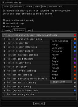
Overview Settings/Appearance/Background: Flashy and Solid Backgrounds
- Right click and make the following blinky:
- Pilot is at war with your corporation/alliance
- Pilot is at war with your militia (to distinguish between militia wt/outlaw/bad standing/security status below 0)
2. Put an X in the following boxes:
- Pilot is at war with your corporation/alliance
- Pilot is at war with your militia (to distinguish between militia wt/outlaw/bad standing/security status below 0)
- Pilot has bounty on him (to distinguish between outlaw/security status below 0/bounty)
Note: the suggested changes to bounty catagory on both Colortag and Background tabs are necessary to make the "bad" categories clearly distinguishable. I have found that it doesn't clutter the overview excessively, and it is comforting to know who to keep a close eye on.
Disclaimer
There are different color vision deficiencies, and my deficiencies are pretty bad. Anything bluish (blue, indigo, purple, dark blue, etc.) is blue to me. Red/Green, Yellow/Bright Green, you get the idea. So, you may need to experiment with the color choices to make it work for you. What ever choices you make should work if you stick with the above blinky/flashy adaptations.
Sign off
Respectfully submitted,
Hypertac Armer
- Work in progress. TOC, example images, color to follow soon.

