Departmental and Community logos - unification of style
EVE University's many Departments and Communities have their own unique, colorful logos. Many of these are designed by the Communications Department, in accordance with the wishes of the Manager or Director of that Department. We want to encourage creativity and design freedom as much as possible in these logos, but aim to lay down some guidelines and design principles to enhance recognizability and a Uni-form style between the Departments.
Baseline
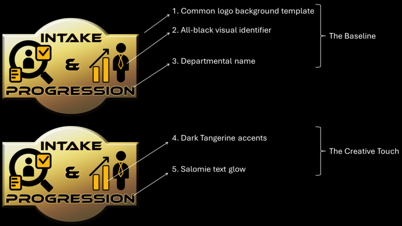
All EVE University Departmental and Community logos should use the common logo background template from the Uni Graphics Library in its original 1,889 × 1,368 pixels size for easy down-scaling as needed (without loss of detail). The Department or Community should then be visually identified by way of an icon or symbol that speaks to them, which should be colored predominantly in black. The Communications Department recommends simple and visually clean icons. For some examples, prospective logo designers can take a look at other Departmental logos.
The Department or Community name should then be laid out on the logo, again in all-black lettering. The ideal font for this is Ethnocentric, from the Style Guide font guidelines, which can be downloaded from various sources online.
Creative touch
Now that you have the base of your future logo down, it's time to add some creative sparkle to your design. We recommend the addition of some colorful highlights to your all-black icons or symbols, with the Dark Tangerine "Uni Orange" color. Additionally, to make your Department or Community name stand out more, especially if it overlaps with your symbols or icons, we urge the addition of a glowing border around the text. For this, we recommend the Salomie color.
Final check
That's how simple it can be! If you followed all these steps, your finished logo should now look something like this:

