More actions
No edit summary |
Added Rayanth's CSS improvements |
||
| (17 intermediate revisions by 2 users not shown) | |||
| Line 1: | Line 1: | ||
__NOTOC__ | |||
Project: Replace front page with Agency-like interface, CSS card system | Project: Replace front page with Agency-like interface, CSS card system | ||
First steps: | First steps: | ||
* Determine sizes (and zoom) levels of Agency cards in-game both before and after mouse-hover | * Determine sizes (and zoom) levels of Agency cards in-game both before and after mouse-hover - DONE | ||
* Determine expand (& zoom) timings from in-game | * Determine expand (& zoom) timings from in-game | ||
** Initial mouse-over to Begin border expansion: 75ms | ** Initial mouse-over to Begin border expansion: 75ms | ||
** Begin border expansion to end border expansion: 100ms | ** Begin border expansion to end border expansion: 100ms | ||
** End border expansion to end image zooming: ~ 2820s | ** End border expansion to end image zooming: ~ 2820s | ||
* replicate expand (& zoom) behavior in CSS on-wiki | * replicate expand (& zoom) behavior in CSS on-wiki - example found | ||
** Animations on ::hover, with keyframes for timing? | ** Animations on ::hover, with keyframes for timing? | ||
* Determine what Topics/Categories (and how many total) will be represented | |||
** Musts: | |||
*** EVE University | |||
*** UniWiki (how to contribute, etc.) | |||
Decide which size cards to use on the wiki | Decide which size cards to use on the wiki | ||
| Line 22: | Line 28: | ||
== Notes == | == Notes == | ||
Timings of hover & zoom, initial findings: | Timings of hover & zoom, initial findings: | ||
~ 75ms after | ~ 75ms after mouse-hover before border expansion begins<br> | ||
~ 100ms to accomplish border expansion<br> | ~ 100ms to accomplish border expansion<br> | ||
~ 2825s to finish zooming background image in after border expansion<br> | ~ 2825s to finish zooming background image in after border expansion<br> | ||
| Line 34: | Line 40: | ||
For Mobile: <br> | For Mobile: <br> | ||
JS to switch target link, so first tap on card triggers the expansion & zoom, second tap goes to page? Is that intuitive enough, or would user expect second tap to shrink the card again? | JS to switch target link, so first tap on card triggers the expansion & zoom, second tap goes to page? Is that intuitive enough, or would user expect second tap to shrink the card again? | ||
== Enlarge image with hover over == | |||
[https://www.wpdecoder.com/css/enlarge-image-on-hover-effect/ enlarge-image-on-hover-effect] | |||
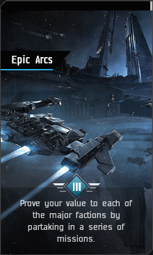
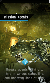
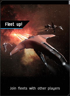
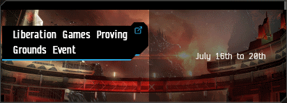
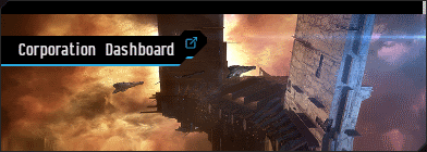
== Agency card sizes == | |||
[[File:Tutorial-agency-expended.png]] | |||
[[File:Tutorial-agency.png]] | |||
[[File:Mission-agents-expended.png]] | |||
[[File:Mission-agents.png]] | |||
[[File:Fleet-up-expended.png]] | |||
[[File:Fleet-up.png]] | |||
[[File:Corporation-dashboard-expended.png]] | |||
[[File:Corporation-dashboard.png]] | |||
[[File:Agents-and-missions-expended.png]] | |||
[[File:Agents-and-missions.png]] | |||
== Notes == | |||
Make image independent of the text? - write text over the image? scale both together? font? | |||
::Yes, all of the above. [[User:Rayanth|Rayanth]] - <em>Wiki Manager</em> 06:30, 24 July 2021 (UTC) | |||
== Prototype area == | |||
If you expand the smaller image, it becomes blurry. However, if you reduce the larger image in size (to the size of the unexpanded image) and then expand it on hover-over, there is no loss in resolution! :) | |||
<div class="enlarge"> | |||
<div class="center"> | |||
[[File:Tutorial-agency.png]] | |||
</div> | |||
</div> | |||
<div class="enlarge"> | |||
<div class="center"> | |||
<div class="ensmaller"> | |||
[[File:Tutorial-agency-expended.png]] | |||
</div> | |||
</div> | |||
</div> | |||
<div class="center"> | |||
[[File:Tutorial-agency-expended.png]] | |||
</div> | |||
== Prototype: stacking == | |||
<div class="enlarge"> | |||
<div class="center"> | |||
<div class="ensmaller"> | |||
[[File:Mission-agents-expended.png]] | |||
[[File:Mission-agents-expended.png]] | |||
[[File:Mission-agents-expended.png]] | |||
[[File:Mission-agents-expended.png]] | |||
[[File:Mission-agents-expended.png]] | |||
</div> | |||
</div> | |||
</div> | |||
<div class="enlarge"> | |||
<div class="center"> | |||
<div class="ensmaller"> | |||
[[File:Fleet-up-expended.png]] | |||
[[File:Fleet-up-expended.png]] | |||
[[File:Fleet-up-expended.png]] | |||
[[File:Fleet-up-expended.png]] | |||
[[File:Fleet-up-expended.png]] | |||
</div> | |||
</div> | |||
</div> | |||
<div class="enlarge"><div class="center"><div class="ensmaller">[[File:Tutorial-agency-expended.png]]</div></div></div> | |||
<div class="enlarge"><div class="center"><div class="ensmaller">[[File:Tutorial-agency-expended.png]]</div></div></div> | |||
<div class="enlarge"><div class="center"><div class="ensmaller">[[File:Tutorial-agency-expended.png]]</div></div></div> | |||
<div class="enlarge"><div class="center"><div class="ensmaller">[[File:Tutorial-agency-expended.png]]</div></div></div> | |||
<div class="enlarge"><div class="center"><div class="ensmaller">[[File:Tutorial-agency-expended.png]]</div></div></div> | |||
<div class="enlarge"><div class="center"><div class="ensmaller">[[File:Corporation-dashboard-expended.png]]</div></div></div> | |||
<div class="enlarge"><div class="center"><div class="ensmaller">[[File:Corporation-dashboard-expended.png]]</div></div></div> | |||
<div class="enlarge"><div class="center"><div class="ensmaller">[[File:Corporation-dashboard-expended.png]]</div></div></div> | |||
<div class="enlarge"><div class="center"><div class="ensmaller">[[File:Corporation-dashboard-expended.png]]</div></div></div> | |||
<div class="enlarge"><div class="center"><div class="ensmaller">[[File:Corporation-dashboard-expended.png]]</div></div></div> | |||
{{#css: | |||
.ensmaller { | |||
transform: scale(0.97); | |||
} | |||
.enlarge img:hover { | |||
transition: .175s; | |||
transform: scale(1.03); | |||
} | |||
}} | |||
== Additional notes == | |||
The Factorio Wiki has a hoverover inventory grid on its front page under Materials and recepies. | |||
I've tracked down the relevant Templates: | |||
* [https://wiki.factorio.com/Template:Inventory Template:Inventory] | |||
* [https://wiki.factorio.com/MediaWiki:Common.css Common.css] | |||
* look under Template:Inventory | |||
* factorio-icon | |||
* .tab .factorio-icon:hover | |||
* [https://wiki.factorio.com/Template:Icon Template:Icon] | |||
* derived from the above [https://wiki.factorio.com/Template:Imagelink Template:Imagelink] | |||
== Rayanth's Agency Card Prototype == | |||
https://onecreativedragon.com/share/uniwiki/cards/cards.html | |||
<code><nowiki> | |||
.center { | |||
width: 100%; | |||
text-align: center; | |||
} | |||
*.center * { | |||
margin-left: auto; | |||
margin-right: auto; | |||
} | |||
img { | |||
border: 0; | |||
vertical-align: middle; | |||
} | |||
.card { | |||
display: inline-block; | |||
margin: 2em; | |||
background-position: center; | |||
background-size: 100%; | |||
border: 1px solid silver; | |||
position: relative; | |||
} | |||
.card-title { | |||
display: inline-block; | |||
width: 100px; | |||
padding: 3px; | |||
margin-top: 20px; | |||
background-color: black; | |||
} | |||
.card-text { | |||
overflow: hidden; | |||
visibility: hidden; | |||
position: absolute; | |||
color: black; | |||
bottom: 0; | |||
width: 100%; | |||
background-color: rgba(0, 0, 0, 0.7); | |||
height: 0; | |||
-webkit-transition: all 1.5s ease; | |||
-moz-transition: all 1.5s ease; | |||
-ms-transition: all 1.5s ease; | |||
-o-transition: all 1.5s ease; | |||
transition: all 1.5s ease; | |||
} | |||
.standard-card { | |||
width: 220px; | |||
height: 300px; | |||
} | |||
.wide-card { | |||
width: 632px; | |||
height: 132px; | |||
} | |||
.card:hover { | |||
animation-name: embiggen-card; | |||
animation-duration: 3s; | |||
animation-fill-mode: forwards; | |||
} | |||
.card:hover>.card-text { | |||
visibility: visible; | |||
height: 3.5em; | |||
color: silver; | |||
-webkit-transition: all 1.5s ease; | |||
-moz-transition: all 1.5s ease; | |||
-ms-transition: all 1.5s ease; | |||
-o-transition: all 1.5s ease; | |||
transition: all 1.5s ease; | |||
} | |||
@keyframes embiggen-card { | |||
0% { | |||
transform: scale(1.00); | |||
background-size: 100%; | |||
} | |||
5% { | |||
transform: scale(1.03); | |||
background-size: 100%; | |||
} | |||
/* | |||
10% { | |||
transform: scale(1.03); | |||
background-size: 100%; | |||
}*/ | |||
100% { | |||
transform: scale(1.03); | |||
background-size: 110%; | |||
} | |||
} | |||
@keyframes card-text-show { | |||
0% { | |||
visibility: hidden; | |||
} | |||
10% { | |||
visibility: visible; | |||
} | |||
} | |||
</nowiki></code> | |||
Latest revision as of 07:18, 5 October 2021
Project: Replace front page with Agency-like interface, CSS card system
First steps:
- Determine sizes (and zoom) levels of Agency cards in-game both before and after mouse-hover - DONE
- Determine expand (& zoom) timings from in-game
- Initial mouse-over to Begin border expansion: 75ms
- Begin border expansion to end border expansion: 100ms
- End border expansion to end image zooming: ~ 2820s
- replicate expand (& zoom) behavior in CSS on-wiki - example found
- Animations on ::hover, with keyframes for timing?
- Determine what Topics/Categories (and how many total) will be represented
- Musts:
- EVE University
- UniWiki (how to contribute, etc.)
- Musts:
Decide which size cards to use on the wiki
Templatize the cards so they can be used more easily
- Template variables:
- Image
- Title
- Detail Text
- Page-link
Notes
Timings of hover & zoom, initial findings:
~ 75ms after mouse-hover before border expansion begins
~ 100ms to accomplish border expansion
~ 2825s to finish zooming background image in after border expansion
Total: about 3 seconds (2825+100+75 = 3000ms) to accomplish the full sequence.
Keyframes triggered on ::hover
0 = resting state, lasts 75ms
1 = border fully expanded, background image also expanded same amount, lasts 100ms
2 = background image fully expanded, lasts 2825ms
Mouse-out resets state to 0.
For Mobile:
JS to switch target link, so first tap on card triggers the expansion & zoom, second tap goes to page? Is that intuitive enough, or would user expect second tap to shrink the card again?
Enlarge image with hover over
Agency card sizes
Notes
Make image independent of the text? - write text over the image? scale both together? font?
- Yes, all of the above. Rayanth - Wiki Manager 06:30, 24 July 2021 (UTC)
Prototype area
If you expand the smaller image, it becomes blurry. However, if you reduce the larger image in size (to the size of the unexpanded image) and then expand it on hover-over, there is no loss in resolution! :)
Prototype: stacking
Additional notes
The Factorio Wiki has a hoverover inventory grid on its front page under Materials and recepies.
I've tracked down the relevant Templates:
   * look under Template:Inventory
   * factorio-icon
   * .tab .factorio-icon:hover
* derived from the above Template:Imagelink
Rayanth's Agency Card Prototype
https://onecreativedragon.com/share/uniwiki/cards/cards.html
.center {
    width: 100%;
    text-align: center;
}

*.center * {
    margin-left: auto;
    margin-right: auto;
}

img {
    border: 0;
    vertical-align: middle;
}

.card {
    display: inline-block;
    margin: 2em;
    background-position: center;
    background-size: 100%;
    border: 1px solid silver;
    position: relative;
}

.card-title {
    display: inline-block;
    width: 100px;
    padding: 3px;
    margin-top: 20px;
    background-color: black;
}

.card-text {
    overflow: hidden;
    visibility: hidden;
    position: absolute;
    color: black;

    bottom: 0;
    width: 100%;
    background-color: rgba(0, 0, 0, 0.7);
    height: 0;
    -webkit-transition: all 1.5s ease;
    -moz-transition: all 1.5s ease;
    -ms-transition: all 1.5s ease;
    -o-transition: all 1.5s ease;
    transition: all 1.5s ease;
}

.standard-card {
    width: 220px;
    height: 300px;
}

.wide-card {
    width: 632px;
    height: 132px;
}

.card:hover {
    animation-name: embiggen-card;
    animation-duration: 3s;
    animation-fill-mode: forwards;
}

.card:hover>.card-text {
    visibility: visible;
    height: 3.5em;
    color: silver;
    -webkit-transition: all 1.5s ease;
    -moz-transition: all 1.5s ease;
    -ms-transition: all 1.5s ease;
    -o-transition: all 1.5s ease;
    transition: all 1.5s ease;
}

@keyframes embiggen-card {
    0% {
        transform: scale(1.00);
        background-size: 100%;
    }
    5% {
        transform: scale(1.03);
        background-size: 100%;
    }
    /*
    10% {
        transform: scale(1.03);
        background-size: 100%;
    }*/
    100% {
        transform: scale(1.03);
        background-size: 110%;
    }
}

@keyframes card-text-show {
    0% {
        visibility: hidden;
    }
    10% {
        visibility: visible;
    }
}
